KITCHEN GARDEN// Brand Building

The brief:

After the success of Suzette, Antonia Achache, Jeremie Sabbagh and Pierre Labail wanted to create a restaurant that was vibrant, quick-service and had a focus on health. Inspired by fresh produce, local ingredients and the simplicity of plucking herbs from potted plants on your kitchen window sill, Kitchen Garden was born.

Our task was to create an identity and extended collaterals for the brand that highlighted these elements and conveyed the message of freshness and health.

PROJECT YEAR

2016

CLIENT

Kitchen Garden

PROJECT TYPE

Hospitality

Location

Mumbai

The Solution:

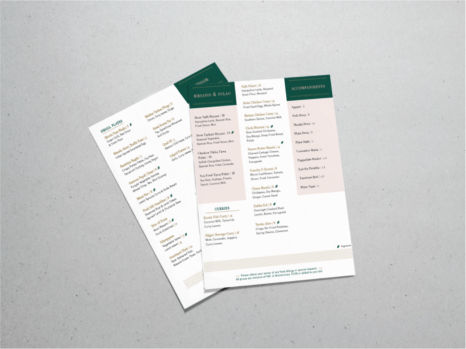
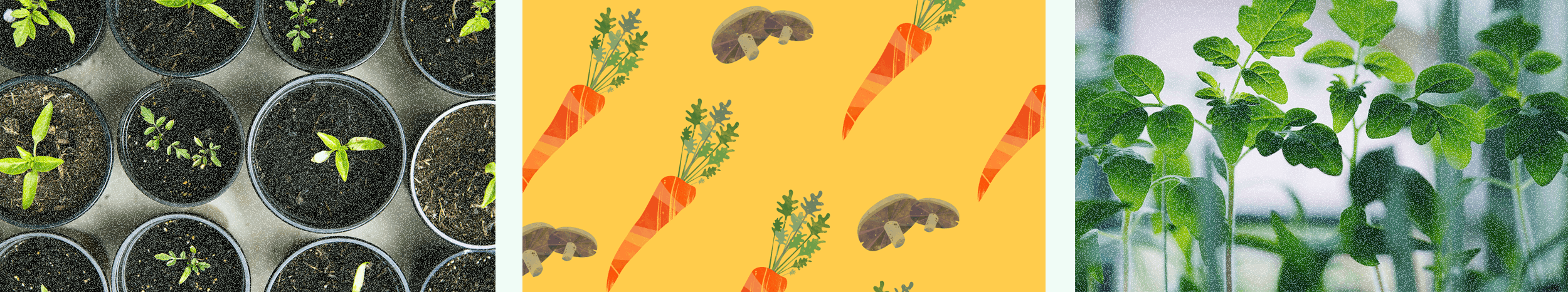
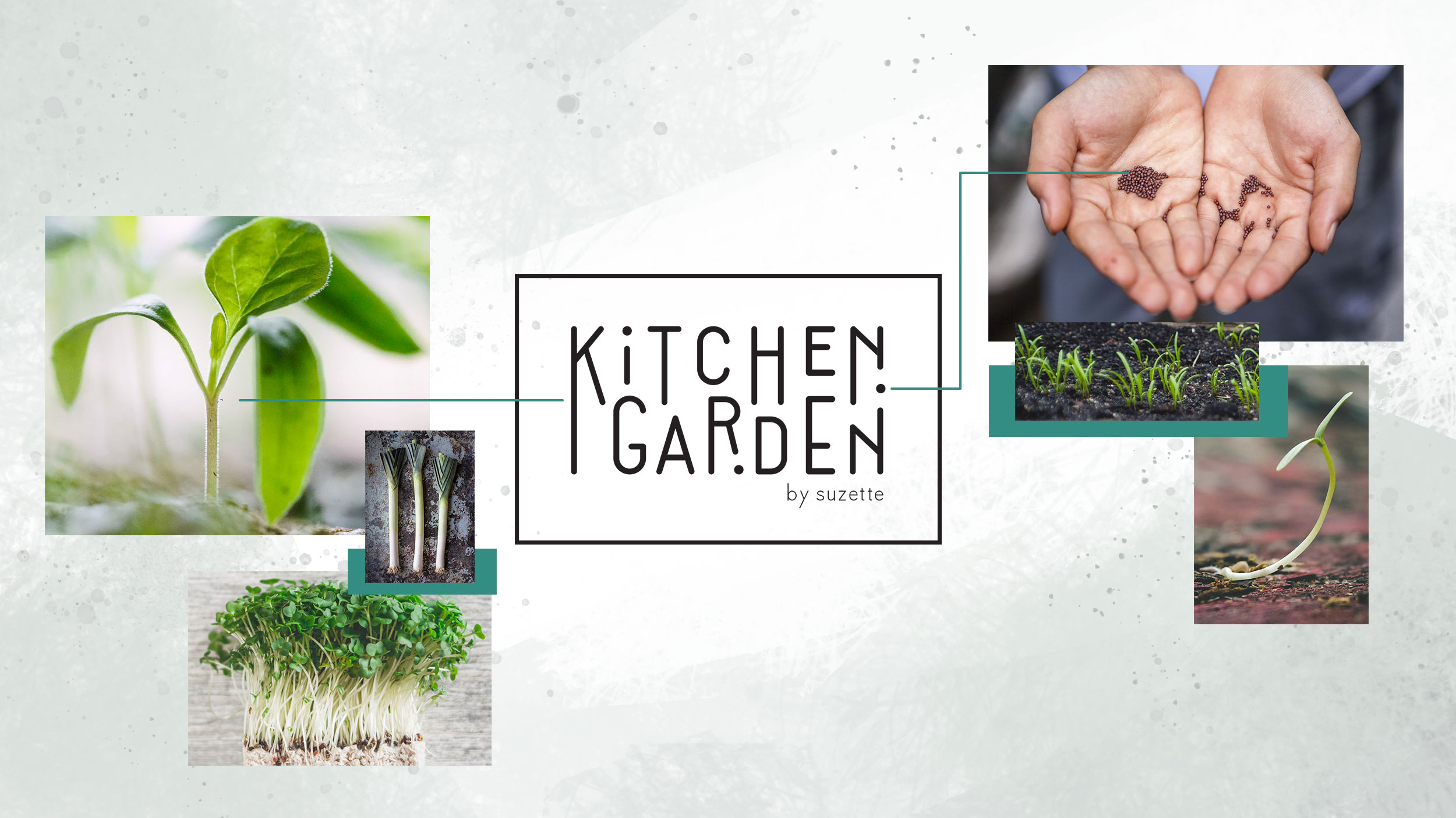
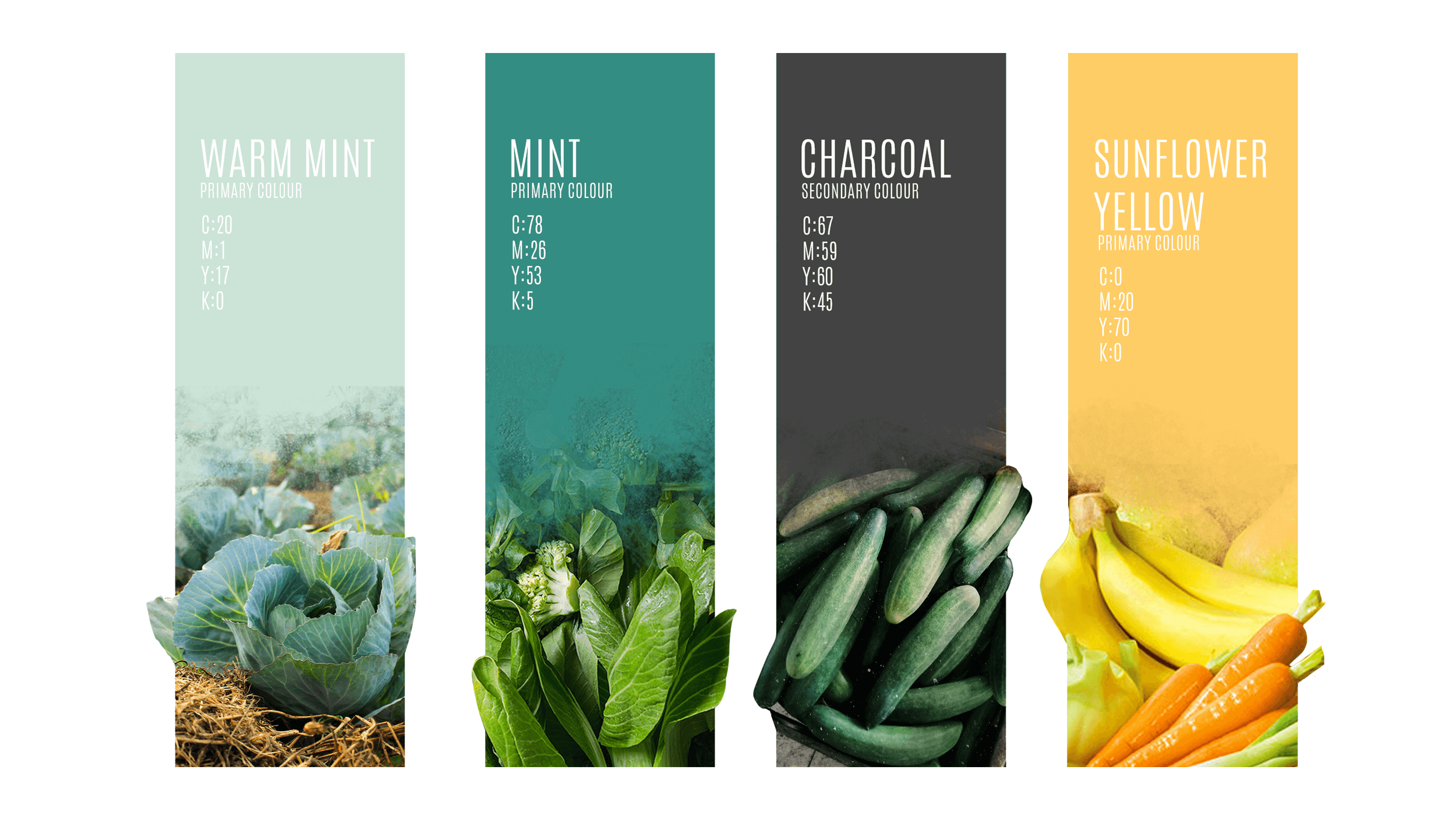
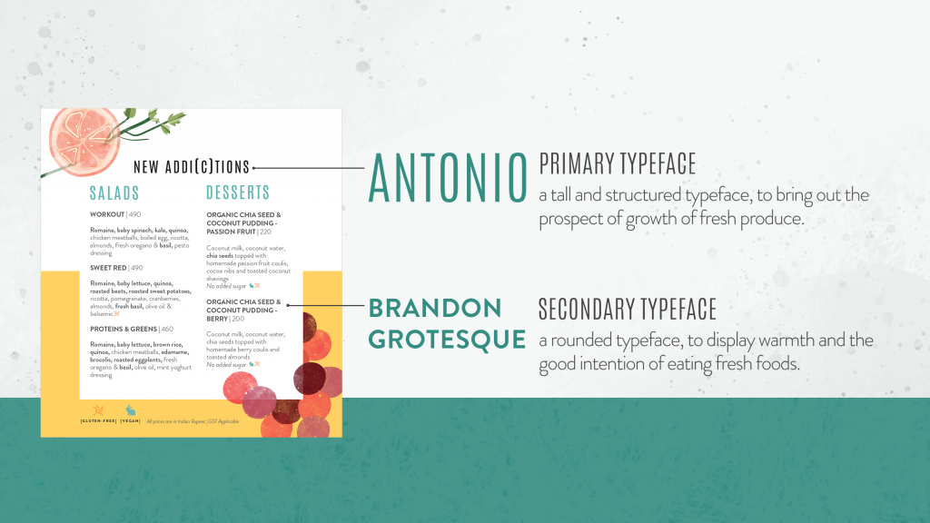
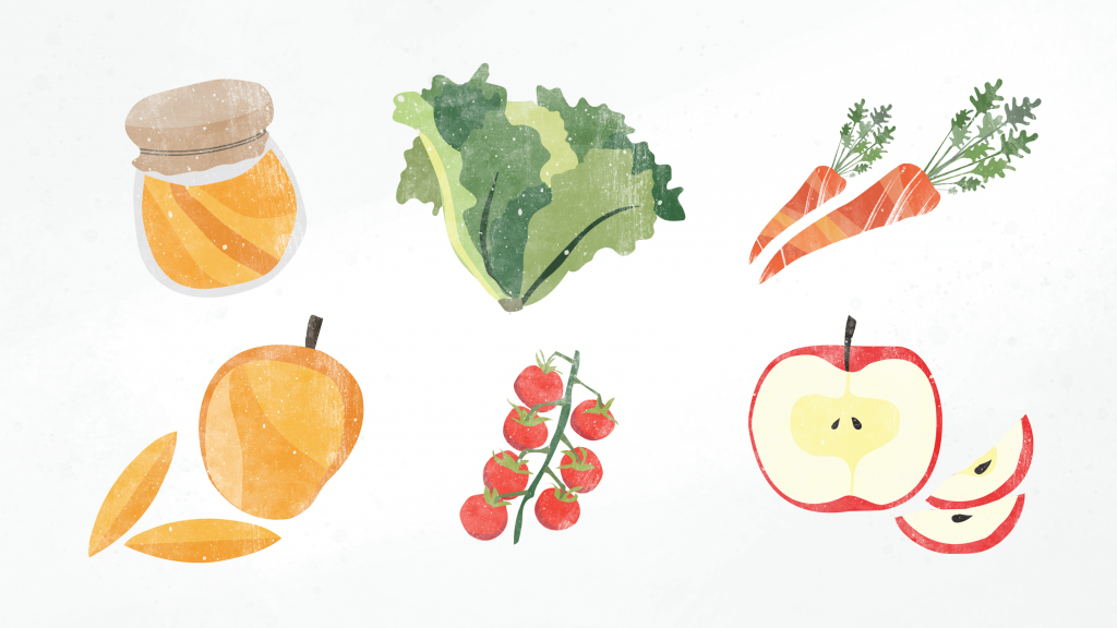
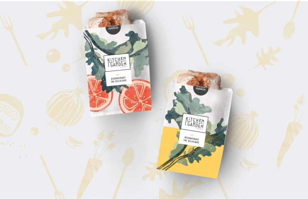
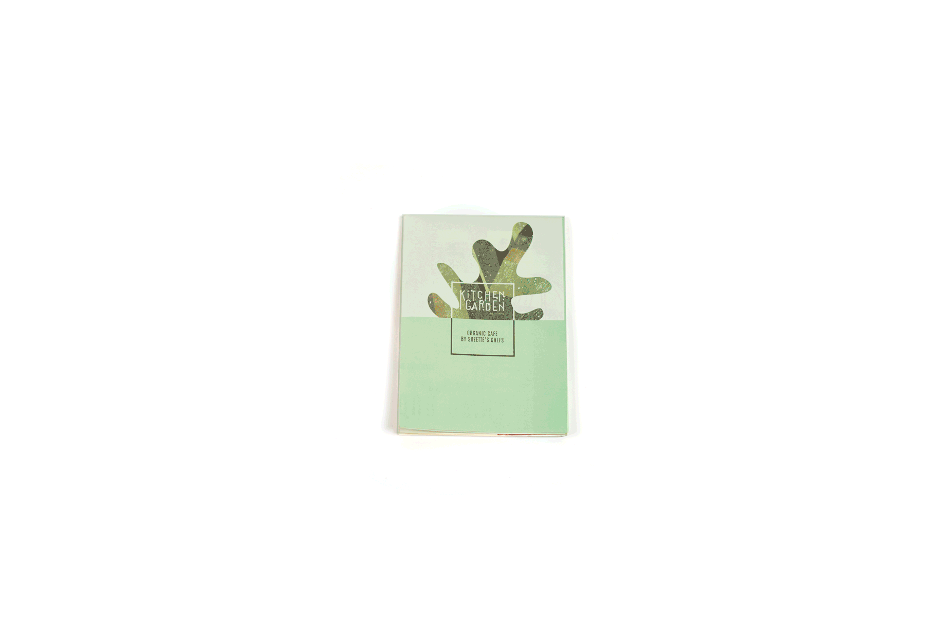
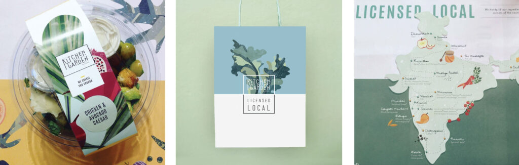
We began by creating a unique identity for Kitchen Garden. The logo was designed to bring out health, fresh produce and growth, while the typography used helped us convey our ‘farm to table’ concept. Since our goal was to bring out the freshness of Kitchen Garden’s produce, we settled on using natural colours, textured illustrations and created an identity that tied back to the core ethos of the brand.

We also highlighted the high-quality, healthy, organic food that the restaurant served through our tagline, “#LicensedLocal”. This allowed us to further communicate to our guests that Kitchen Garden only used the choicest ingredients, sourced from the finest local suppliers, using no artificial flavours or processed ingredients.

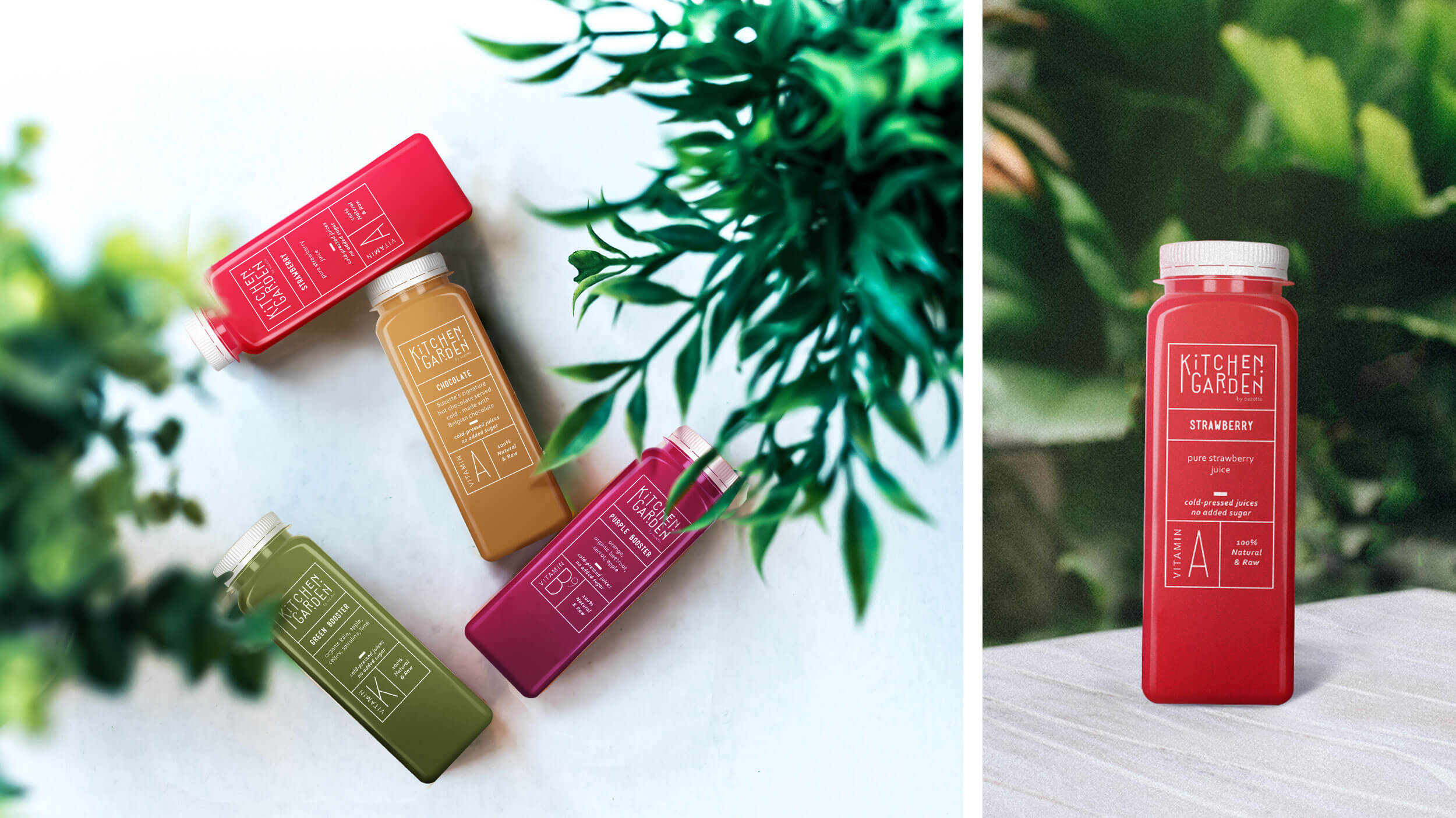
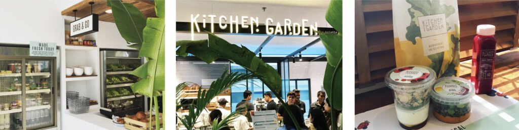
Additional benefits we offered our clients and their guests were the way the food and beverages were displayed at the restaurant. We analysed how other brands displayed their dishes and created an easy ordering system that allowed guests to view Kitchen Garden’s range, while also letting them customise their orders per the preferences. The juices offered at the restaurant were also displayed in transparent bottles, allowing guests to see the colour and almost feel the texture of each beverage. This too helped us convey to our guests that all their juices were 100% natural and were freshly made.

The Road So Far:

We have now taken the brand a step further and set up on-the-go versions of Kitchen Garden. These kiosks are installed at the CBRE office building and Platina business centre, both in the heart of BKC.

By staying true to Kitchen Garden’s philosophy, we have helped the brand earn a clutch of awards including the Times Food Awards and repeated mentions in local city guides such as Lonely Planet.

BOMBAY BUSTLE// Brand Building

The brief:

The Leela group approached us and asked us to create an identity for a new restaurant they were opening in Mayfair, London. Since they wanted the restaurant to celebrate the local trains in Mumbai and the dabbawalas – the unsung heroes of the city – our designs and ideas had to be inspired by the same, while still keeping the brand elegant and accessible.

Our research of the people in the area revealed that while most of the consumers were working professionals and Indian families, the restaurants were upmarket and expensive. We had to ensure that our space was quick, reasonably priced and an everyday eatery for guests.

Project Year

2017

Client

The Leela group

Project Type

Hospitality

Location

London

The Solution:

To capture the essence and the importance of the local trains and the dabbawalas, we positioned our brand as ‘The pulse of the city’ – because if they stop working, the city shuts down. We therefore arrived at the name Bombay Bustle.

What excited us even more was the ambience of the restaurant. Since it was designed to look like a train compartment from a Wes Anderson film, the identity and extensions we created had to complement the concept. While we had to retain the ethos of Bombay Bustle, we also had to bear in mind the aesthetic of our clients and their legacy. We created an identity that was inspired by signs at train stations and the lid of a dabba. We used muted shades of grey, gold and pink that resembled the interiors of a train, with the element of flair captured in the quintessential Wes Anderson production.

We also realised that dabbawalas use a complex coding system. A set of letters and numbers written on the lid that let them to know where each dabba has come from and where it needs to be delivered. This inspired us to add a more authentic, nuanced element to the brand’s identity. We developed a unique code of our own that differentiated one Bombay Bustle restaurant from another.

To give the brand a face, familiarity and credibility, we set up a photoshoot with Samyukta Nair and head chef Rohit Ghai in a moving train. This helped us bring the lifeblood of Mumbai to the streets of London. A photoshoot of the picturesque Ballard Estate too helped us bring out the Wes Anderson-themed environment of the restaurant.

Today, Bombay Bustle is thriving and is your go-to restaurant if you want a bit of Mumbai in Mayfair.

ANANDA// Packaging Design

THE BACKGROUND:

Ananda is an award-winning luxury destination spa & resort situated at the Himalayan foothills in Northern India. As one of the finest luxury wellness retreats in India, it integrates traditional Ayurveda, Yoga and Vedanta with international wellness experiences.

Project Year

2015

Client

Ananda

Project Type

Fashion & Beauty

Location

Mumbai

The Objective:

Ananda was looking to expand into retail with their existing range of oils, creams, scrubs, lotions and hair products that were currently only used in their spa. Our objective was to create a design and packaging structure that could be extended into B2C retail and into their line of products.

The Solution:

Ananda as a brand emphasises being at one with nature, promotes ancient Indian practices (through the concept of chakras) and takes you back to when holistic living was a way of life. However, we soon noticed that while chakras evoke emotion and make consumers feel a certain way, what draws a consumer to a cosmetic product is its texture and the way it feels when interacted with.

We therefore used varying textures and colours based on the product and its function – softer colours and textures were used for moisturisers, while scrubs had a deeper, rougher texture on their packaging.

Since we didn’t want to do away with Ananda’s focus on chakras, we decided to extend the number of chakras we highlighted from 4 to 7, to associate each product category to a specific emotion, scent and ingredient.

We also had to ensure that our packaging and design encouraged consumers to purchase treatment packages and not just individual products. To accomplish this, we added numbers to each product and product package, making them more relatable, giving them a more youthful feel and also assisting in the purchase of treatment packages.

To tie it all together, on the inside cover of the packaging, we verbally communicated how each chakra should make the user feel. This brought in an element of physical interaction with the product, that gave consumers an added sense of positivity and made them feel like they were being taken care of.

We were finally left with an amalgamation of elements that were visually engaging, in line with the brand’s ethos and told our story effectively.

CANTEEN COCKTAIL BOOK// The 1st Edition

The Problem:

In 2015, we got to brand, position and create an identity for The Bombay Canteen, which is now one of the country’s most feted restaurants. When they came to us, the team wanted to “recreate” the Indian food experience and make it more relevant for the present day. The brand had to be truly Bombay in spirit and Indian at heart, without channeling India kitsch.


A few months into the Canteen’s launch however, they realised that their dishes had become the talk of the restaurant and had eclipsed a large part of the Canteen experience, the bar and their homegrown cocktails. Our challenge was to draw attention to and prompt interest in their well-curated cocktails

Project year

2017

Client

The Bombay Canteen

Project Type

Hospitality

Location

Mumbai

The Solution:

We couldn’t simply revert to the happy hours and deals format to draw attention to the bar as that would have been an easy fix. Instead, we wanted to create a conversation and experiences around the bar.

This led to the idea of the Canteen Cocktail book, not a mere menu that lists out the drinks, but a book with a strong Bombay narrative and a direct connection to the nuanced drinks on offer. And so, the first edition of Canteen Cocktails was born…

Canteen Cocktails First Edition: Art Deco

Mention Liberty Cinema at The Bombay Canteen and the staff is likely to show up at your table with a bubbly gin cocktail blushing like raspberry. The drink, a heady mix of gin, sparkling wine and raspberry juice was inspired by the Art Deco icon in Marine Lines and is a glamorous toast to the cinema hall’s glitzy past.

Liberty occupies the first page of the first edition of the Canteen Cocktails book that celebrates Mumbai’s rich Art Deco heritage. Nine other buildings made the shortlist for the book, the pages of which are iconicised as posters in a section of The Bombay Canteen. The book, which is part menu, part recipe book, part research document and part design project has also made it to the shelves of Nicobar, a lifestyle and gifting store chain.

Drinking Rhymes:

After extensive research, which also included picking the brains of loyal guards and watchmen, some as old as the building they keep secure, we decided that the stories of these Art Deco wonders should be written in rhyme.

We took another creative risk with the menu and designed it as a pop-up book, so that the design matched the verbal creativity. Following this, the Canteen’s fantastic team of bartenders, added the third, final layer of creativity by crafting cocktails to suit the mood, the emotions and the charming stories that these buildings inspired.

The Hangover:

Three years later, the cocktails have changed several times over, but the first edition of the book still remains a talking point for Canteen regulars and book collectors, who purchased copies of the recipe-heavy menu for their libraries and bars.

We didn’t stop there however, follow this link to know all about the second edition of Canteen Cocktails.

CANTEEN COCKTAIL BOOK// The 2nd Edition

PROJECT YEAR

2018

CLIENT

The Bombay Canteen

Project Type

Hospitality

LOCATION

Mumbai

Boss! One more round, please!

With the first edition of Canteen Cocktails being a roaring success, we simply had to keep the momentum going. There were so many nuances of Bombay we could base our book on, but after extensive thought, ‘The slang that envelopes the streets of Mumbai’ came out victorious.

Canteen Cocktails Second Edition: Celebrating the Mumbai in Bombay

Our second Canteen Cocktail book offered tipplers a crash course on Mumbai’s unique slang, ‘the words caught between the bogeys of the local, overheard at the macchi market, words that run the street and become the soundtrack of Mumbai’. Familiar to some and alien to others, the words filled the Canteen as you had to utter them to order the cocktails that they inspired.

In Mumbai’s street parlance, a Bantai is a friend, but not just any friend. It refers to the special bond typically between two men prone to interlocking their pinky fingers while walking on the street. Inspired by this strange fetish, the Bantai was an odd albeit endearing coupling of dark rum, raspberry liqueur, pineapple, plum bitters, starfruit, lime and egg white.

Among some Jhakaas others, a crowd favourite in terms of the word, the sentiment (and the cocktail) was Boss, a phrase used for the street smart, the cops, the taxi drivers, anyone who roams Mumbai with enough authority and swagger. To match the spirit of ‘boss’, the Canteen crafted a cocktail that balanced whisky, smoky single malt, creme de cacao, fresh beetroot juice, orange, pineapple, and bitters.

Form:

After the first pop-up menu, which was lapped up as a Mumbai collectible by locals and tourists, we took a completely new creative risk with the second edition of the book. It was February and book number two was laid out as a calendar, not your regular, one-dimensional desktop companion, but a loud, larger than life interactive installation of sorts dressed in neon colours, loud fonts and prints typically found in Mumbai’s taxis, rickshaws and fabric shops. The calendar was kept decidedly busy to reflect the chaos and cacophony of our manic city.

The Result:

Inspired by the layered cocktails in this book, we went a step further and layered our menu/calendar with hints, songs and tips. It became, as we had hoped, a quick reckoner on Mumbai’s hidden landmarks, names of beach cleaning activists, tour operators, animal-focused NGOs and other motley takeaways.

Two down, and the Canteen Cocktail local keeps chugging along. Follow this link to read about the third edition.

CANTEEN COCKTAIL BOOK// The 3rd Edition

PROJECT YEAR

2018

CLIENT

Bombay Canteen

PROJECT TYPE

Hospitality

LOCATION

Mumbai

Canteen Cocktails Third Edition: A Guidebook to the Talkies of Bombay

We waited till the third edition of Canteen Cocktails to explore a dream theme – the city’s affair with the Talkies. For this project, we got Bombayphile, Bombay expert and Bombay tour operator Simin Patel to breathe life back into these once-glorious buildings through her words.

Once Simin’s literature poured in, the menu started shaping up as a guidebook to six of the city’s most iconic single-screen cinemas that sparked Bombay’s affair with the movies. We immediately parked ourselves outside each of the six, sketching the beauties and imagining all the drama that unravelled in front of and behind their weathered screens.

The Cocktails:

The plot thickened, as it does in all good Hindi movies, with the cocktails. As Simin identified the iconic movies that made these cinema halls famous, The Bombay Canteen bartenders got to work crafting drinks to match the drama.

Miss Frontier Mail, a potent concoction of gin, Triple Sec, egg white, orange and lime, was named after the Fearless Nadia film that had a long run at Imperial Cinema, and made to match the feisty spirit of its fearless heroine.

The bartenders interpreted Shakti Kapoor’s double role in the 1962 film China Town as two drinks on their menu listed under one name. Order a China Town and you will be presented with a choice, a drama-packed Johnnie Walker cocktail with a smokey single malt, pandan tincture, hibiscus syrup and bitters; and a beer by Great State, brewed just for this dynamic cocktail.

Form:

Part menu, part guide, the book shaped up into a gift for locals and tourists, complete with recipes and a map to go cinema-hopping. The book was even laid out in such a way that if you wanted to take a tour of the talkies, you simply had to move from one to the other in the order in which they have been presented in the book, without the aid of an actual guide.

Epilogue:

After 6 months of intense ideation, research, planning, recipe testing and more, we agreed that each cocktail book should be launched with a grand party based on the theme of the books. Bolstered by the highly anticipated Canteen Cocktail Party, the books have remained in circulation and conversation long after the drinks were refreshed. Glance around the Canteen tables and you will now see a balanced mix of Canteen cocktails and signature dishes, which is all the motivation we need to return to the drawing board to plan for the next edition of Canteen Cocktails.

MAMI// Event Branding

THE BRIEF:

The Mumbai Academy of the Moving Image (MAMI) is a public trust that organizes the annual Jio MAMI Mumbai Film Festival with Star India.


While they had enjoyed success since their inception, they now wanted the event to become more inclusive, relatable, younger and more approachable. They therefore needed an identity that was fun, dynamic and playful, and was flexible enough to work across platforms.


The backdrop of all this had to be Mumbai, and the festival had to celebrate and involve this vibrant city.

Project Year

2016

Client

MAMI

Project Type

Entertainment

Location

Mumbai

The Seed Idea:

When we looked at what MAMI stood for and how it made people feel, we realised the brand stood for passion, inspiration, enthusiasm and culture.

Building on these core values, we finally arrived at our seed concept – “Fishing for Talent”. This idea was inspired by the Kolis – the original inhabitants and the lifeblood of the fishing industry in Mumbai. It also stemmed from the brand’s purpose, which was to celebrate and provide a platform for everyone who ‘swam’ into the city, looking to showcase their work.

The Brand Language:

We began by creating an identity for the brand that would stand out, but also something that the city could feel was their own. While the previous logo was generic and cliché, we wanted to create a logo that was contemporary and inspired from where we came from. The new logo design uses illustrations and intricate lines to spell out ‘MAMI’ in the traditional Devnagari script, making it relevant and relatable. The thought was succinct, if you need fresh waters to swim in, MAMI streams are now flowing.

From colour palettes and typefaces to patterns and photography, we ensured all our designs reflected the seed idea and captured the essence of Mumbai. We used shades of blue to represent water, while using a mixture of bright and pastel colours that represented the hustle & bustle that is Mumbai city.

The verbal language too, was fun, witty and light, with references to the sea, fishing and Mumbai, to reinforce the new identity and its meaning.

All this together would then have to be extended onto posters, merchandise, emailers, banners, hoardings, standees and other MAMI communication.

The Result:

The 18th MAMI Film Festival, saw attendees and guests taking to social media to talk about the festival and share their experiences.

Twitter was the most active social media platform for the festival, with roughly 5.5 million impressions, with Facebook close behind.

Newspapers too featured the festival, with English, Hindi, Gujarati and Marathi publications all talking about celebrity appearances, movie screenings, interviews and events.

CINCIN// Wine Book Design

Defining the problem:

Along with being known for their hand-rolled pastas and Italian small plates, CinCin also has an extensive wine list and was in the process of launching their very own house-wine. Our job was to build the concept of wine, not as a drink for the discerning, but as an easy beverage that effortlessly blends into every meal.

Project Year

2018

Client

CinCin

Project Type

Hospitality

Location

Mumbai

The Solution:

Our idea was to position CinCin as everybody’s go-to wine bar. We therefore decided to create a special wine menu titled, “More vino, per favore”, or “More wine, please”.

This menu was designed to meet 3 objectives:

1. To make wine more approachable.

2. To highlight CinCin’s wine collection.

3. To introduce the world to CinCin’s very own house wine, the CinCin Rosso.

To accomplish this, we personified 10 of CinCin’s most popular wines and the CinCin Rosso, based on flavour notes, aromas and the overall feeling the wine offered its drinker.

Our Process:

Our research showed us that India especially, is not a wine-drinking nation, and as we delved deeper into wine culture and etiquette, we realised that wine still remained desperately unapproachable. We needed to create something that was enjoyable, light-hearted and relatable — just like CinCin is.

The concept we arrived at was succinct, subtle and in line with the brand ethos — If you were a bottle of wine, which one would you be?

What we had to keep in mind:

Since CinCin is a portrayal of Italy that is more the Amalfi Coast on spring break than the Godfather, it was important for us to treat our designs and communication the same, making them fun, colourful and breezy. However, we had to ensure our menu offered guests some form of utility.

To solve this problem, we added in 2 significant elements:

1. A wine recommendation on each page

2. A bookmark that highlighted the prices of all the wines in the menu.

The Language:

We ensured our communication was as young and playful as CinCin is, using a mix of fun Italian words, double entendres, alliteration and repetition. Even the tagline for the CinCin Rosso — ‘Que Syrah Syrah’ (a play on the term, Que Sera Sera) included elements of repetition and the use of puns.

The language was then extended to define the personality traits of the characters we created, from the wine label and the menu to everything that went in-store, all to build the experience.

The bright colours and hand lettered typography, have also been used to replicate the joyful feeling of sipping on the Rosso.

The Reveal:

We launched the wine menu and the CinCin Rosso at CinCin’s 1st anniversary party, where guests got a chance to interact with the menu and enjoy the wines featured in it. The ‘Guidebook to Wine’ played a huge role in increasing CinCin’s wine sales, and is now an intrinsic part of the ordering process at the restaurant.

XYXX// Brand Building

The Background:

The curious case of this brand’s story started with a seed idea of curiosity. We wanted to build an underwear brand that encouraged people to make choices that weren’t sexy or practical, but fun. We wanted people to try new things, ask more questions and push their own boundaries.

Project Year

2017

Client

XYXX

Project type

Packaging

Location

Mumbai

Why XYXX?

We were tired of seeing brands that talk to either men or women. We wanted a brand that spoke to both. It only made sense to bring the two genetic chromosomes together as a name for the brand.

Why is the line of the X missing?

Because we wanted people to ask just that. It builds curiosity. You have to admit you were wondering that yourself.

Where did we go from there?

We started designing prints, styles, playing with colours, the works. We had to get off our computers and go into factories to understand which colours run, which prints can be printed, what was the most cost effective method of using colour and print. We’re not fashion designers, so this brand was a whole new world for us. We had to unlearn and relearn a lot in order to design for XYXX.

Where do they sell?

Online. That meant we also had to design a digital presence for them. Here too, we pushed those boundaries. We built the site based on how the customers buy, based on styles of underwear. The fit is what drives purchase and where the web journey starts.

What’s with the Packaging?

Everything! But before we get into that, we realised two things about customers who shop online:

1. They normally shop at work.

2. They use their work address as a delivery address because (unfortunately) that’s where they spend most of their time.

Now we all know that nobody wants people to know that they’re getting their underwear delivered to work. So we decided to create packaging that looks like everything else except underwear. We used coffee tins, shuttle cork boxes and everything else we could find to make the most interesting, reusable and discreet packaging.

What’s the b(r)and got to do with it?

Branding the band is a big deal in the underwear industry. We looked at them all, from the CKs to the Jockeys to the DKNYs and we decided to play somewhere where nobody else was… in between Calvin Klein and everyone else. We found our 2-inch comfort and style factor made people curious to see what the rest of it looks like.

What’s next?

Curiosity killed the cat. Not us.

OML// Website Design

The Brief:

We were approached by OML (Only Much Louder), one of India’s largest artist & event management agencies and tasked to develop 4 distinct websites for their most prominent entertainment festivals, all in 8 months. The festivals – NH7 Weekender, Stage42, The Coalition and U/A – each had their own unique visual and verbal languages and it was up to us to ensure each website was interactive, exciting and flexibly designed.

Project Year

2016

Client

OML

Project Type

Website/Digital

Location

Mumbai

The Solution:

While each festival had a different visual language, and catered to a different set of consumers, the structural back-end components that made up each website were essentially the same – venues needed to be displayed, performers needed to be announced and tickets needed to be sold.

We therefore came up with the idea to build out the back-end logic and components in staggered and systematic releases, wherein each part of the website was robust, well thought out and adaptable at a moment’s notice.

Regarding the look and feel of the websites themselves, it was important for us to design each using the appropriate visual language and aesthetics, all to successfully reflect the true emotion captured by the parent brands.