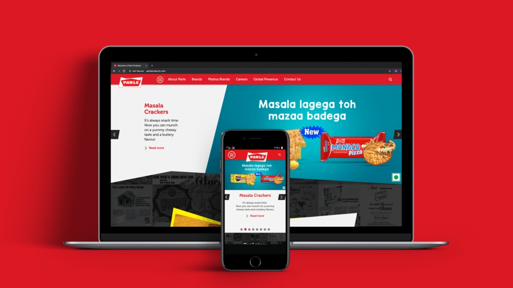
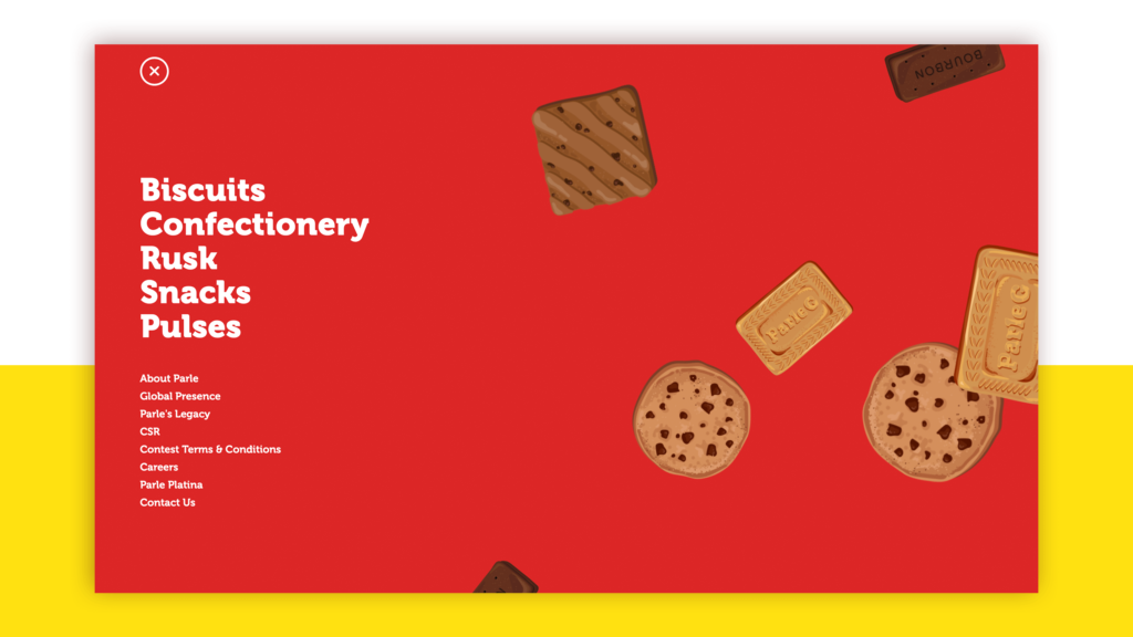
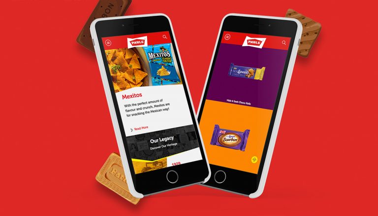
Parle, one of India’s oldest, and certainly one of its favourite FMCG brands, asked us to design their website to suit a more contemporary setting. We had to bring out the rich legacy of the brand, display their wide range of products in an organised, yet interesting way and make the website easy to navigate.
Project Year
2016
Client
Parle
Project Type
Website/Digital
Location
Mumbai
The Solution:
Parle has been one of India’s largest brands for decades, and continues to make its presence felt in not just the FMCG sector. With widespread CSR & Social Initiatives on their portfolio, it was important for us to highlight these along with the evolution of Parle from a single factory company to a heavyweight in its industry.
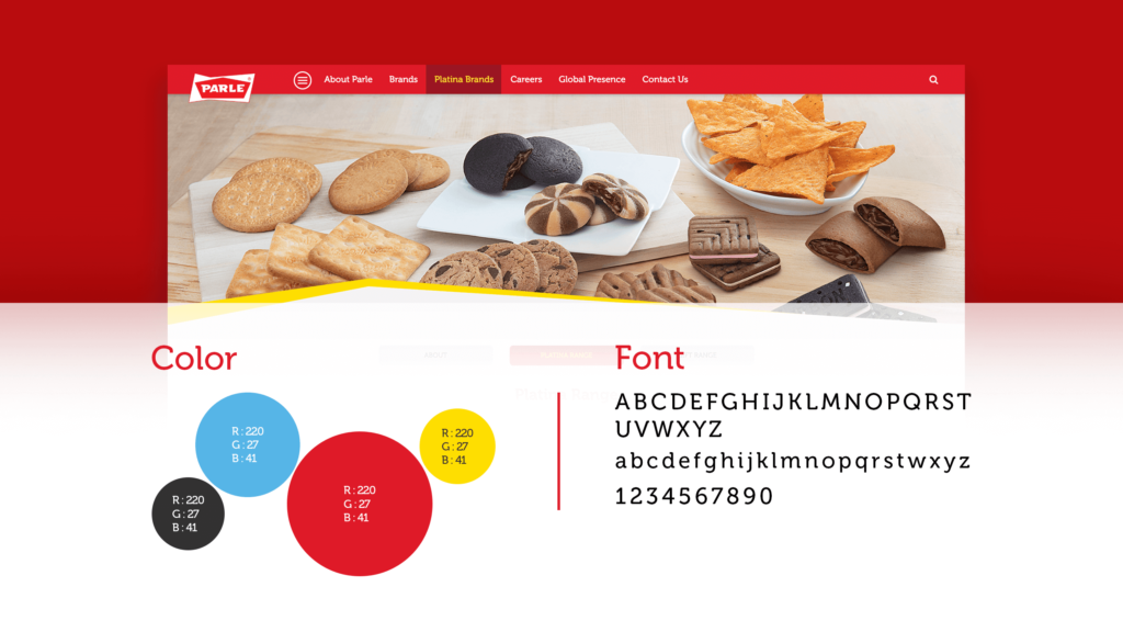
To do this, while making it relevant to today’s audience, we ensured we used younger colours, elements of photography to display our products and made the website more interactive. Parle always stood for trust, taste and quality, and it was important for us to highlight these values through our designs, language and basic user experience.
Integrating the Core Values into the Website
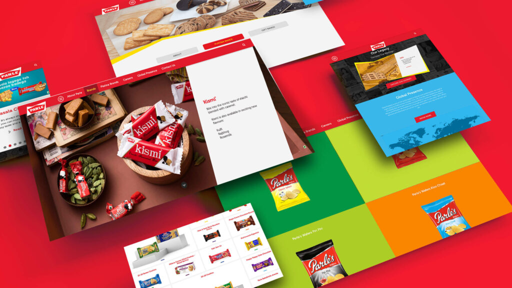
By using photography throughout our website, we ensured users could view our range of products, the ingredients used and interact with the products on a digital platform. This allowed us to highlight the quality and distinct taste of our products in a newer, more interesting format.
To build the idea that Parle is one of India’s most trusted brands, we created a section on the website that highlighted Parle’s legacy by taking users on a journey through time. Right from Parle’s inception to present day, we showed our users how the company had grown, not only through its product range, but also the way the brand’s communication evolved over the years. A treasure trove of past advertisements helped us accomplish this in a unique, nostalgic manner.
We also wanted to highlight the trust that the brand has built since its inception, not only through the quality of products, but also through the CSR initiatives it has taken part in. A separate CSR section on the homepage complete with write-ups and videos helped us accomplish this.
To learn more of our process, the story of Parle and its range of products, visit http://parleproducts.com/
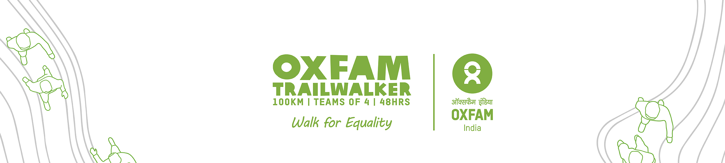
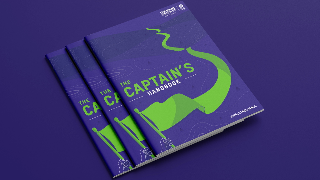
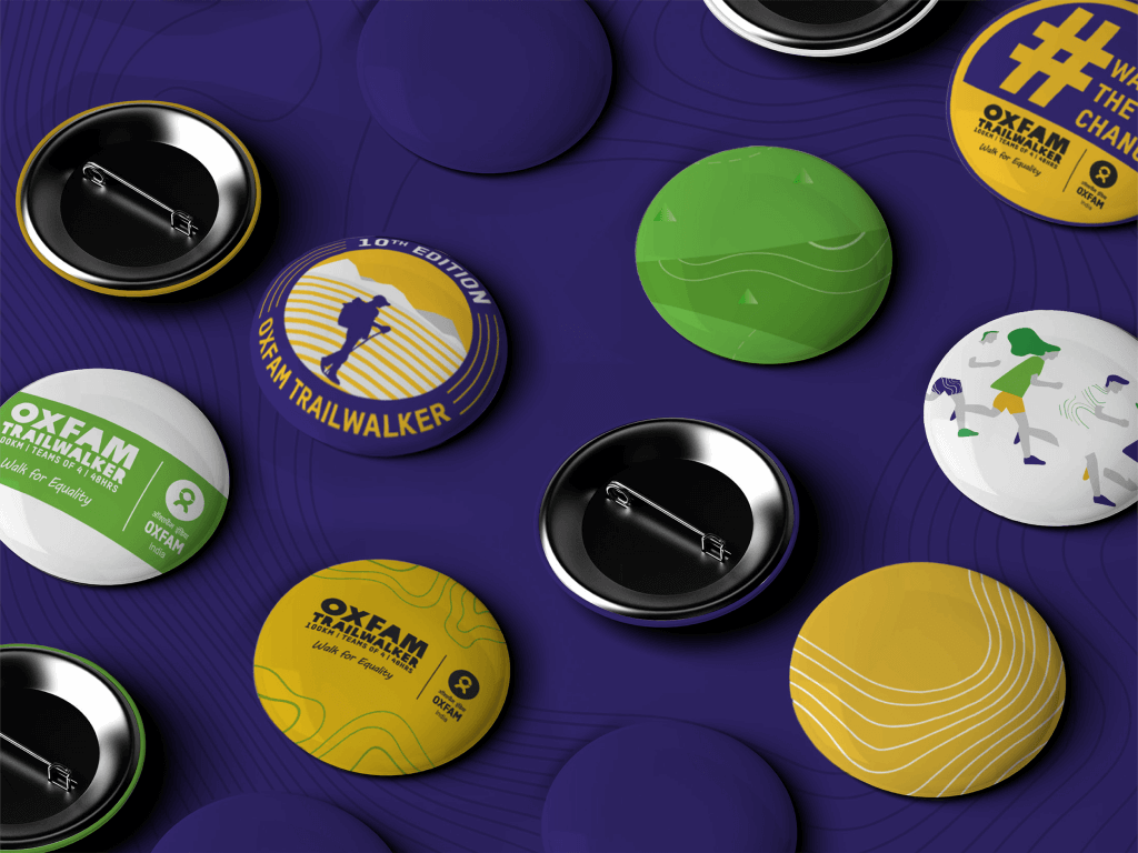
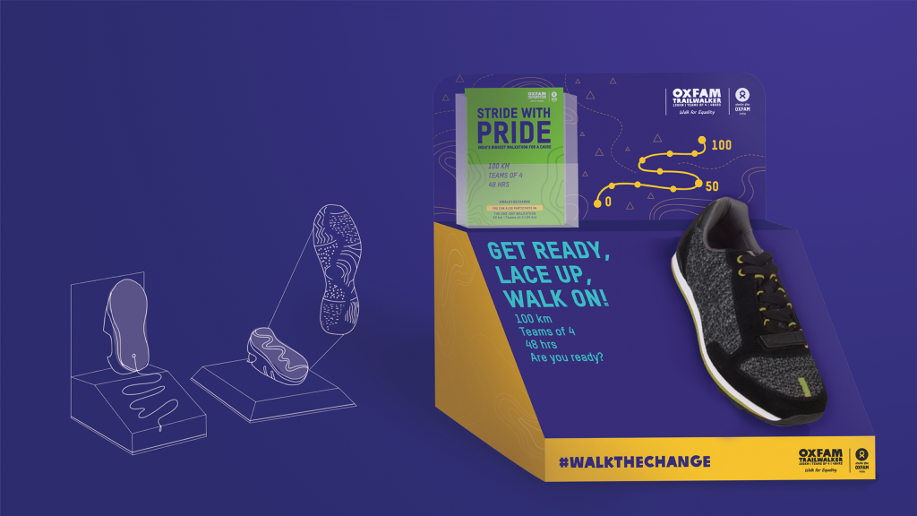
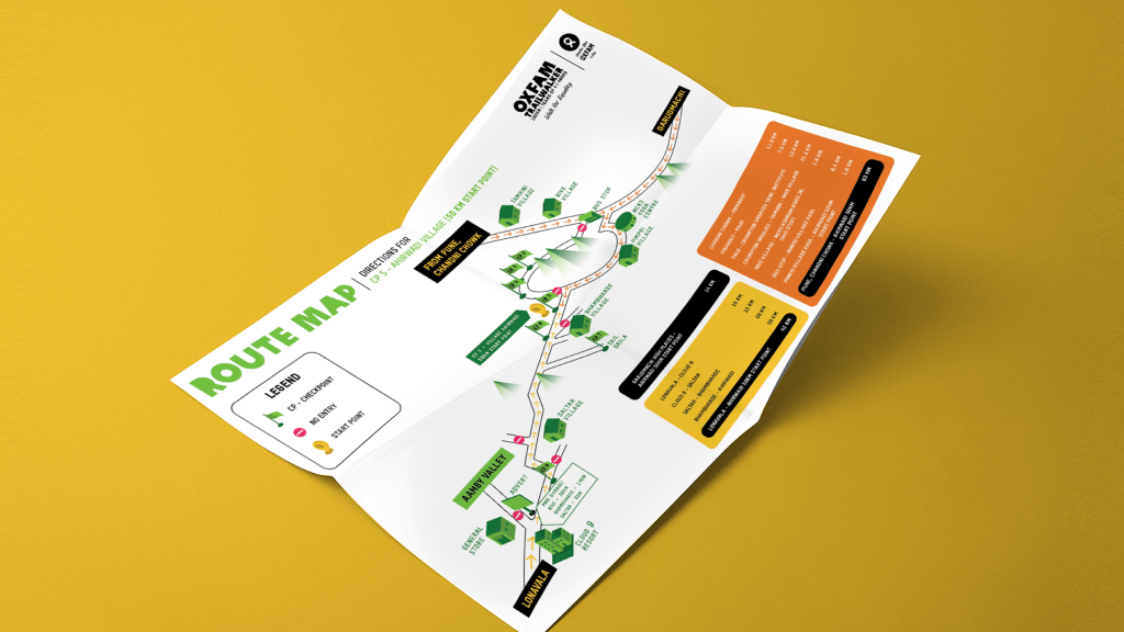
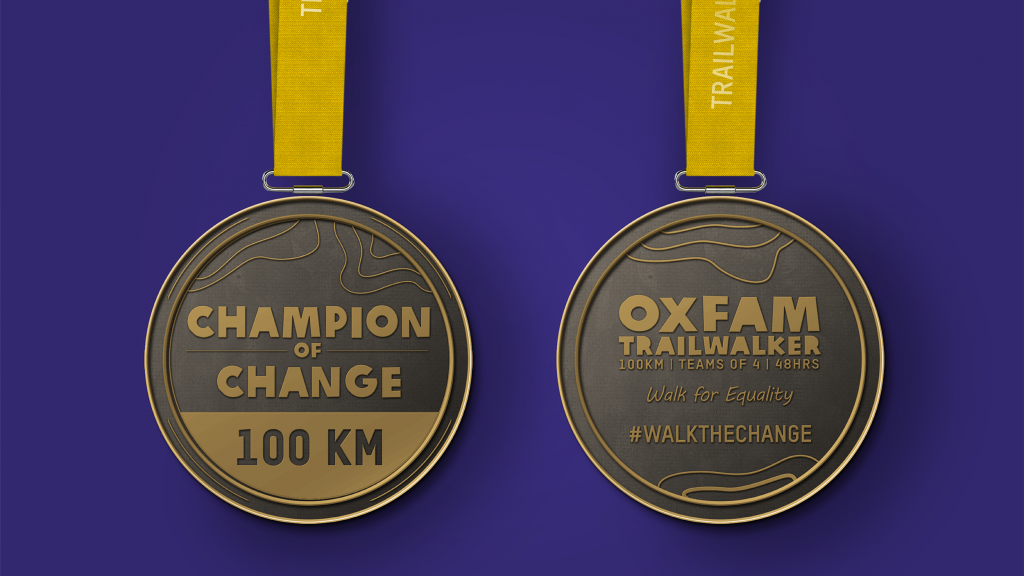
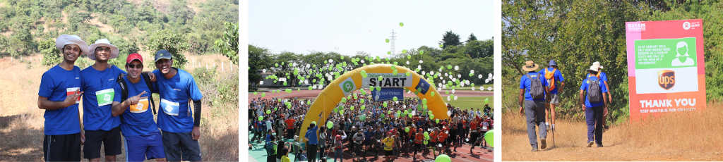
OXFAM TRAILWALKER// Event Branding
THE OBJECTIVE:
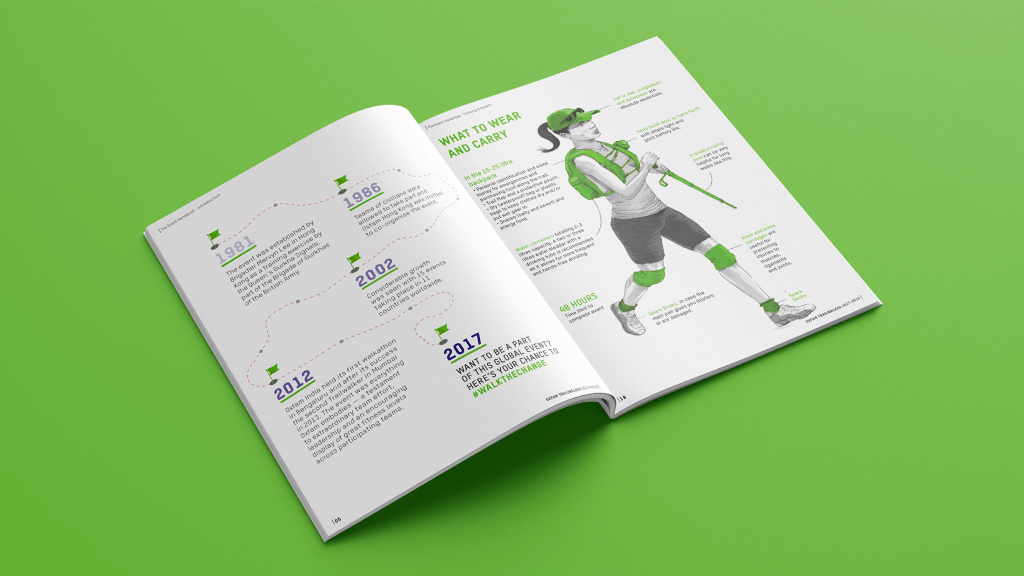
Oxfam Trailwalker is a global event that challenges teams of 4 to walk 100 km in 48 hours in a bid to reduce poverty and inequality in 6 of the poorest states in India. Since 2012, the Trailwalker has brought in several hundreds of participants and volunteers every year. Our objective was to get even more people to participate, by raising awareness and encouraging them to sign up for this life changing experience.
Project Year
2017
Client
Oxfam
Project type
Events
Location
Mumbai
The Solution:
The solution was to make the Oxfam Trailwalker more than just a walk for a cause by building it into a community that brought people, companies and their beliefs together.
The Seed Idea:
After carefully analysing the Oxfam Trailwalker, we finally settled on the idea “Walk the Change” as it made people feel like they were striving for something larger; that they were making a positive impact in the world, by actively being a part of the change they wanted to create.
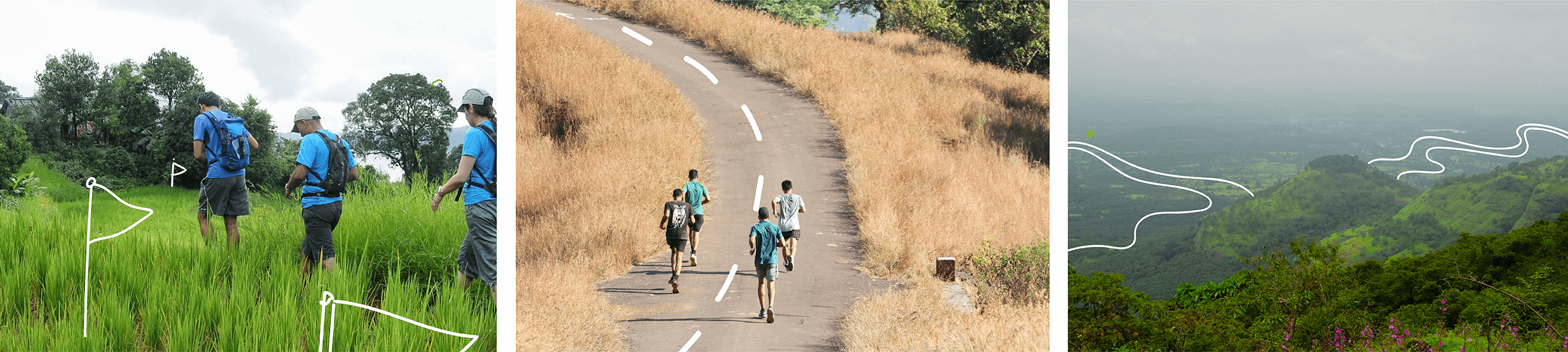
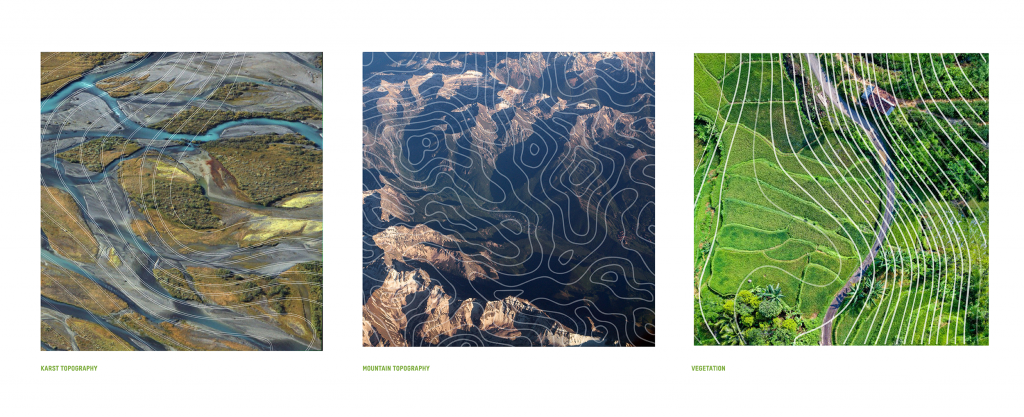
Bringing It All To Life:
Taking from the concept of our seed idea, “being a part of a life changing experience”, we created a visual style inspired by topography. Topography, being a representation of the course of change over time, was used to create a visual depiction of the purposeful and adventurous nature of the Trailwalker challenge. To give our audience a 360° experience of the Trailwalker, our communication took place over four stages:
Building the brand – through point-of-purchase displays and brand ambassadors
Launching the event – by setting up live chats, memorable on-ground experiences, inspirational signboards and interactive photo ops
Post-event engagement – by keeping the conversation going with online blogs, articles and user-generated content
The Result:
With 499 teams taking part, 80% participation from corporates, over 600 volunteers, and an estimated ₹5.5 crores raised (compared to the ₹4.7 crores raised the previous year), Oxfam Trailwalker 2017-18 saw more enthusiasm, energy and determination than ever before.
CLIMATE KUNJI// Designing The Program
The objective:
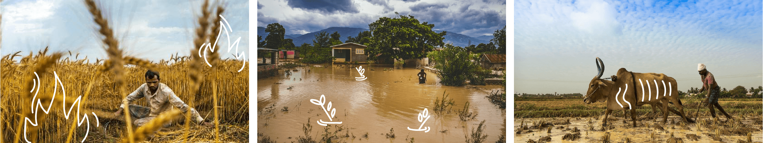
Our client, IPE Global was working for the Ministry of Rural Development (MoRD, India) and Department for International Development (DfID, UK) to create and implement a program that helped village residents combat the effects of climate change with the help of the nationwide MGNREGA scheme.
Our task was to communicate this program to the end-beneficiaries and enable them to take action by understanding its benefits and importance.
Since the program was to be implemented in Chhattisgarh, Bihar and Orissa, the final output was required in Hindi and Oriya.
Project Year
2018
Client
IPE Global
Project Type
Social Work Related
Location
Mumbai
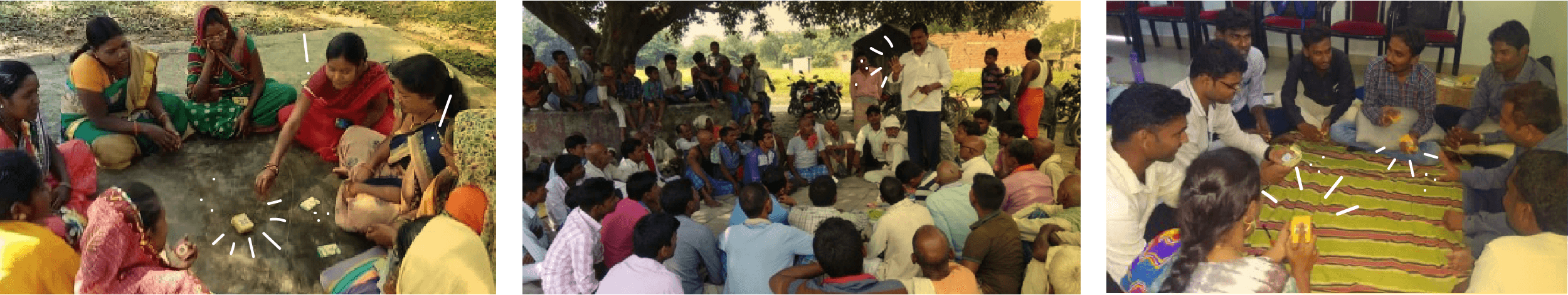
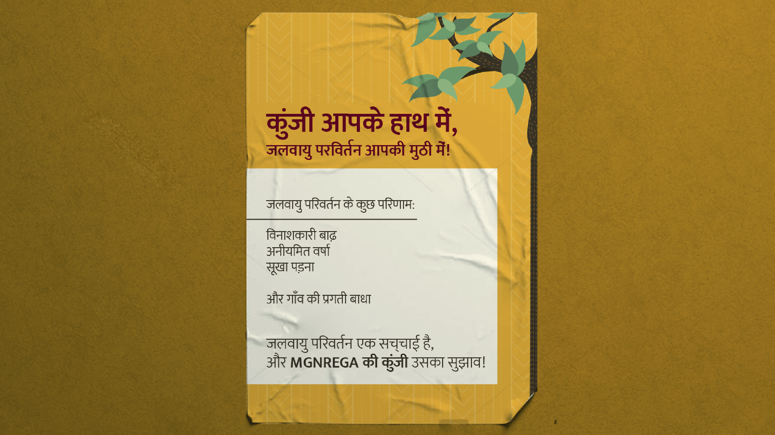
What is Climate Kunji?
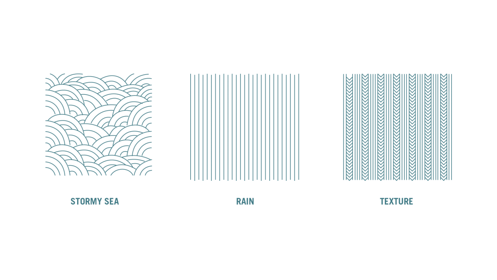
The word Kunji in Hindi means a key. In our context, it was meant to represent the literal key to understanding how the climate is likely to change in the coming years and how it will affect different at-risk areas. The book held details of the likely impact of Climate Change in the locality (over 30 years) and the optimum MGNREGA projects to tackle its effects.
The Problem:
On analysing typical communication targeted at this consumer, we realised that most messaging took a very prescriptive approach. Keeping this in mind, we needed to ensure we didn’t put out a preachy message, but effectively communicated that village residents now had the ability to cope with the ill-effects of climate change.
The ideal case for the Climate Kunji book was to be used during Panchayat meetings to help decide the nature of projects undertaken as part of the MNREGA scheme.
We identified our goal as wanting to get village residents to ask for the tool to be used. Hence the line – Gaon ko bolo, Kunji kholo!
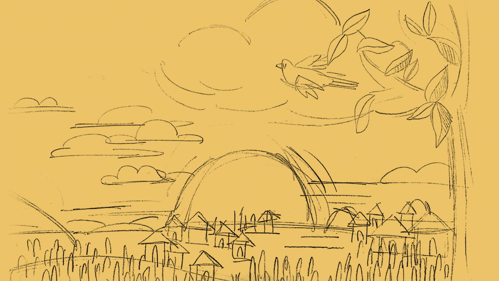
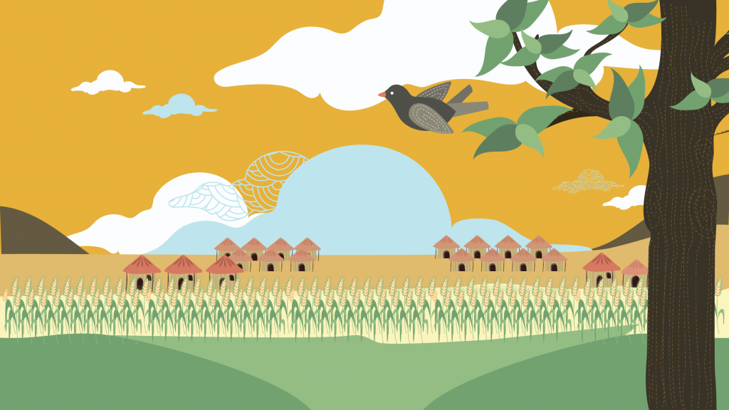
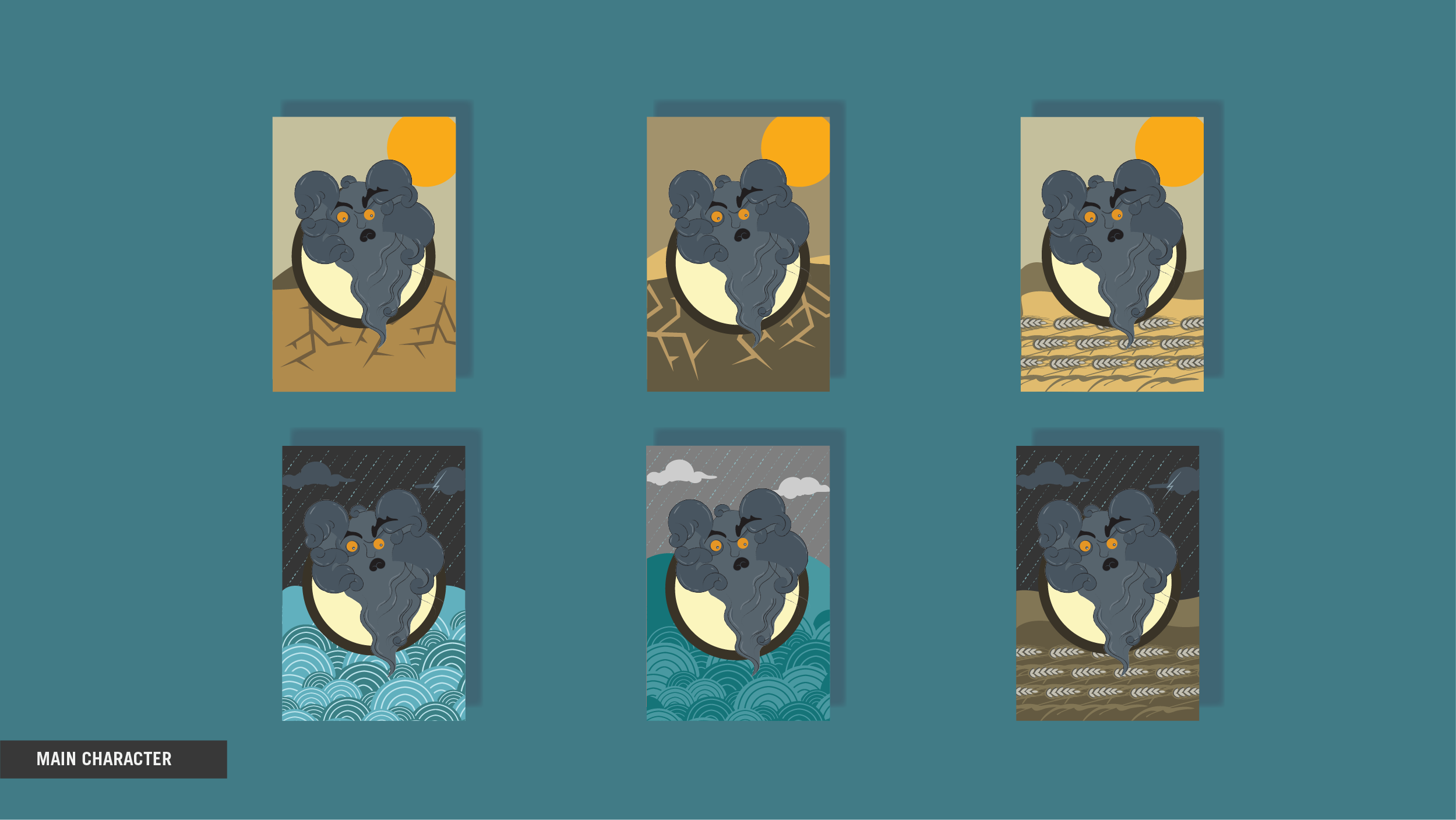
Character Development:
Climate change was personified as an unwelcome guest who had come to the village in the form of “Bhayanak Babu”. This was relatable and helped us effectively highlight the problem. We also gave the character multiple forms to indicate varying levels of intensity.
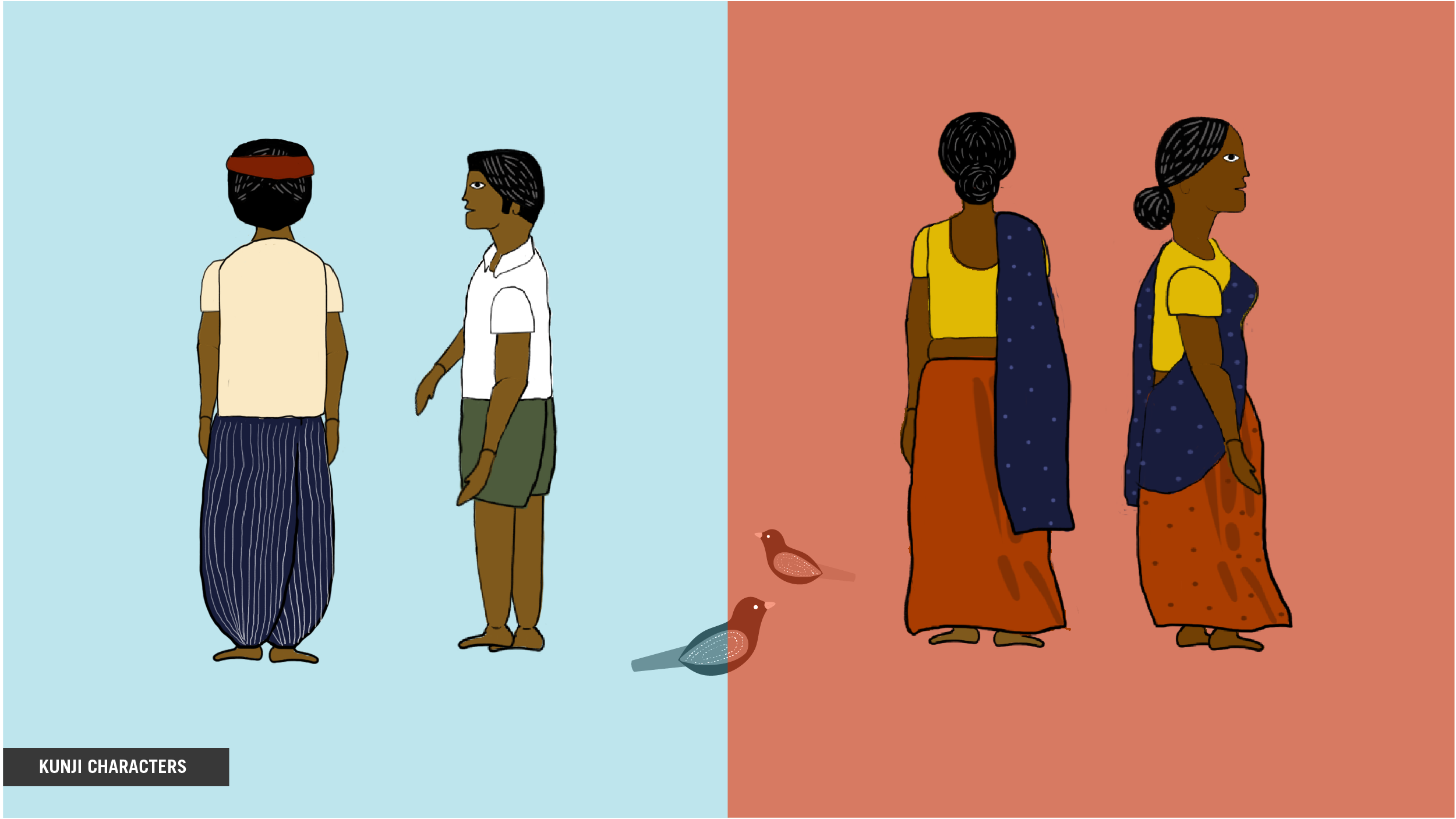
MGNREGA:
The characters created to combat climate change – needed to be reliable and confident figures that everyone could look up to. They were knowledgeable, and problem-solvers. We gave them crisp clothes and a neat appearance to signify their authoritative demeanor.
Building the Narrative:
To make the message more relevant to our audience, we used the elements of theatrical ‘Naatak’ in our narrative structure, language and sound. This meant using simple literary devices like repetition, rhyming and metaphors. The overall story was created with an overarching narrator telling a story in the form of a song to ensure higher recall.
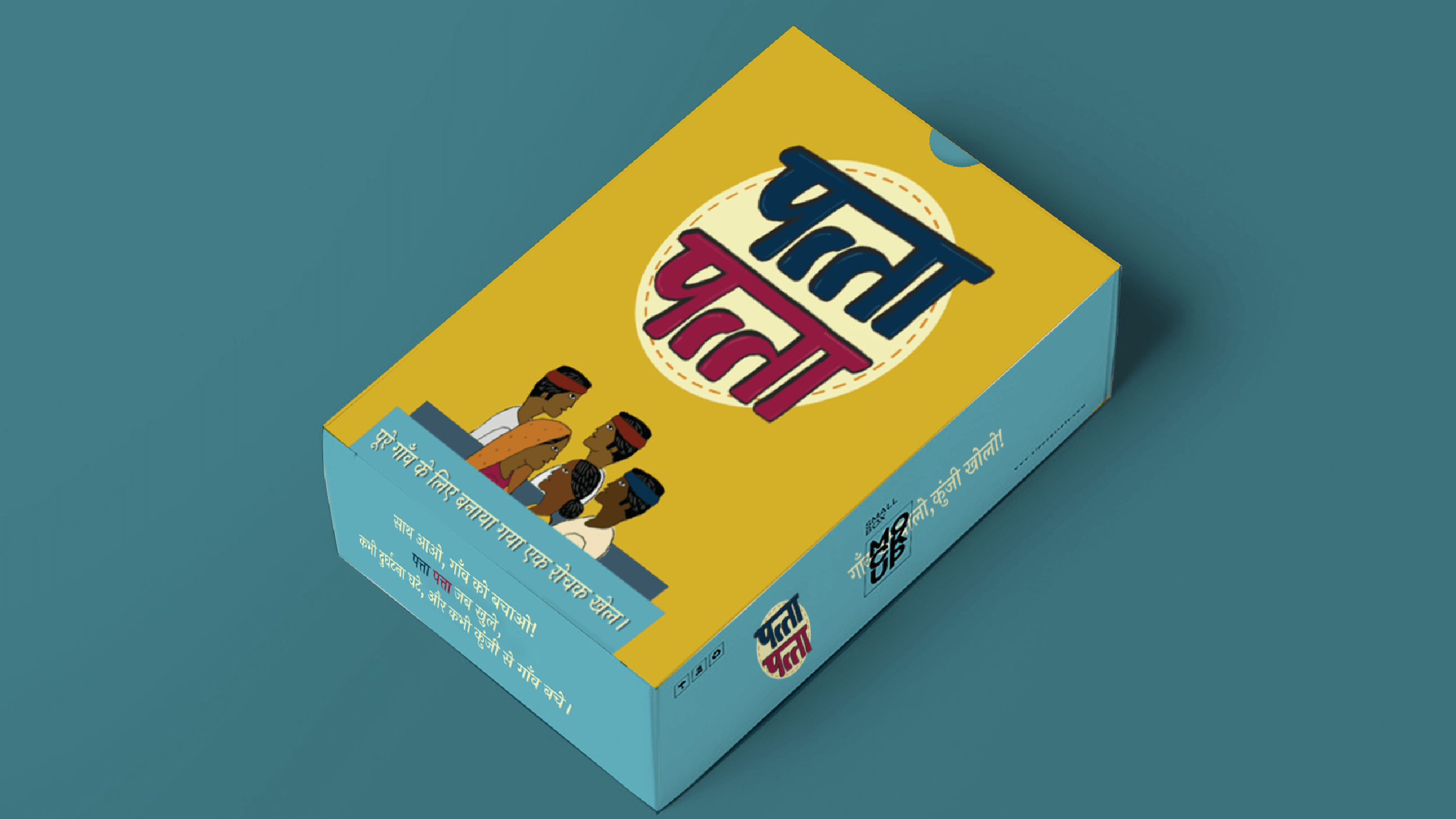
Creating the Game:
When it came to the game, we needed to ensure it is easy to play, portable and could be enjoyed by women, children and men, alike.
We therefore selected a card game for its simplicity and relatability. Capitalising on the audience’s familiarity with card games, we chose to name it ‘Patta Patta’.
Taking it to Print:
We needed to create a simple flyer that was economical to print, and clearly communicated our message. We chose to keep the messaging similar to our video and game by focusing on the idea of “Gaon ko bolo, Kunji kholo!”.
LAZYPAY// Brand Building
Project Year
2016
Client
LazyPay
Project type
Banking & Professional Services
Location
Mumbai
The Background
The only thing Indian millennials love more than their smartphones, is shopping on their smartphones. They just can’t seem to get enough of it! And like everywhere else in the world, they want what they want and they want it now! The millions of transactions that happen in India on smartphones every day prove just how much they love getting what they want, when they want. But there were two problems with this situation:
1. Millennials tend to live from salary to salary, which means they don’t always have the money to SPEND NOW on the things they WANT NOW.
2. They’re so busy on their smartphones they don’t really have any time or money to spare doing the things they love.
Enter PayU India, one of India’s largest payment gateways, to the rescue of the millennials. They wanted to give them a solution that gave these millennials free money (for 2 weeks) in the fastest way possible, so they could get on with the other stuff they wanted to do.
The Brief:
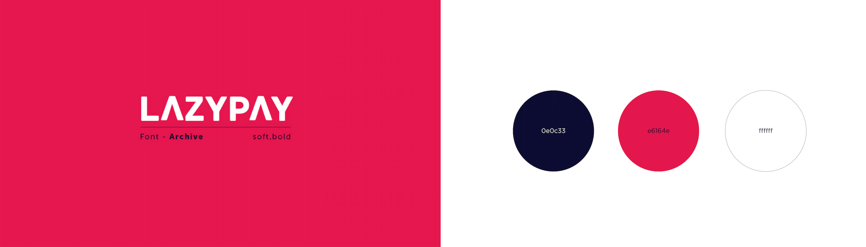
Our Challenge was to build a brand that would stand out visually on any merchant check out screen, and also become a catchphrase for faster online payments. The clients coined the name LAZYPAY; a blend of the words ‘Later’, ‘Easy’, ‘Payments’, our job was to build a brand around it, and we had 32 x 32 pixels of icon space to do that in.
The Solution
Our solution started with the tagline ‘buying you time’ because that’s exactly what the brand was doing; letting you buy what you want now and pay for it later.
Next, we created a responsive, visual identity for the brand using the Fast Forward icon. This was a mnemonic to emphasize just how much time you were saving by using LazyPay to skip the extra steps and check out in less than 5 seconds.
This identity was then extended onto our checkout screens. In order to get customers out of the checkout process in less than 5 seconds, we broke down the steps to include only the bare necessities, bringing it down to a two-step process only.
But it doesn’t just stop there! Our identity was later extended onto their website and email communications to explain the product and its benefits, and remind customers to pay back what they owed.
By the end of it all, we even had a campaign that talked about how LazyPay was your Fast Forward button for all the things you wanted.
And that ladies and gentleman, is how we succeeded in creating a bold and vibrant brand language that had the energy and spunk of our target audience: the millennials.
LazyPay currently has 500 thousand downloads on the Google Play Store, with an estimated 1.5 checkout processes a week. If you do the math, we’ve saved people approximately 835 hours a month and counting…
Please See// giving you more time to do the things you love.
THE BOMBAY CANTEEN// Takeaway Packaging Design
THE CHALLENGE:
More than 26,000 tonnes of plastic is produced in India everyday. Could we possibly start to reduce this? Could we bring back the sustainability we once had in Indian eating habits? Indian food (more than others) when delivered, requires a lot of plastic for practical purposes. The harmful nature of this plastic after a single use, was something we needed to change.
PROJECT YEAR
2017
CLIENT
The Bombay Canteen
PROJECT TYPE
Food Packaging
LOCATION
Mumbai
The Solution:
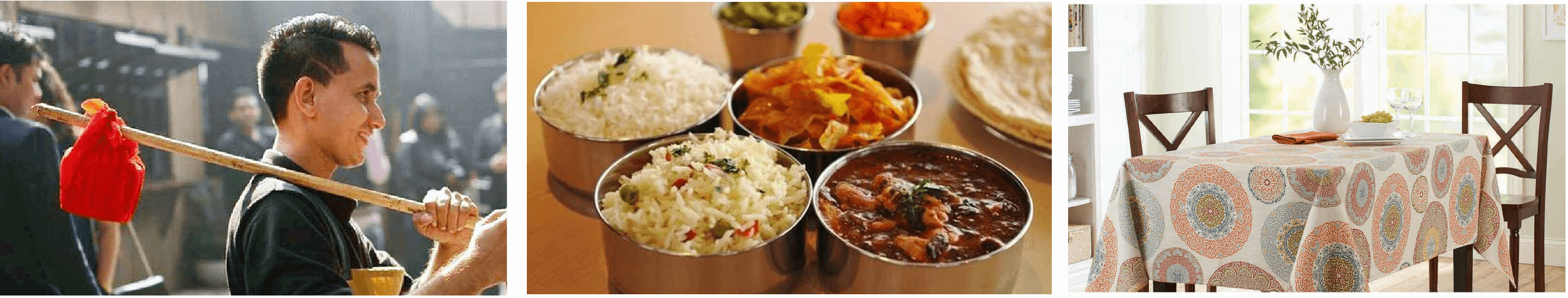
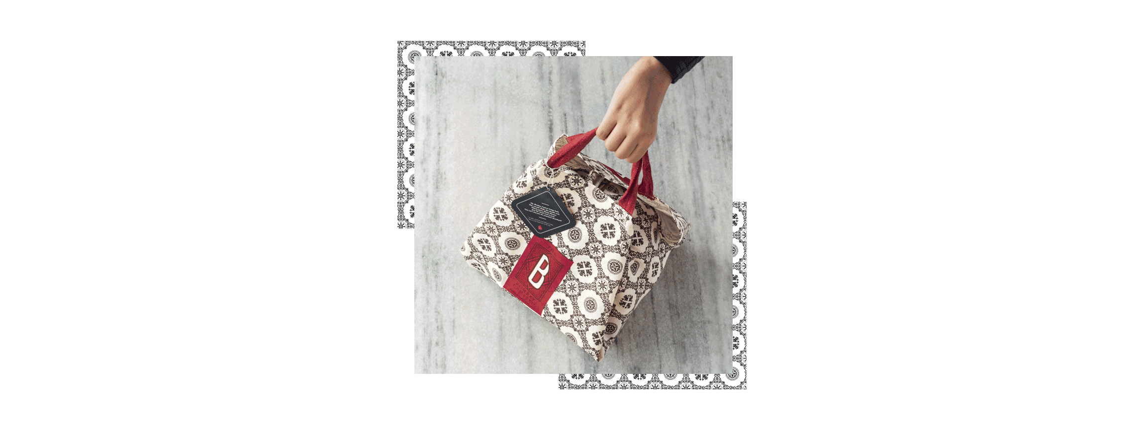
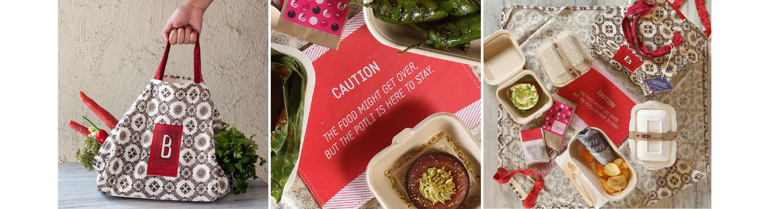
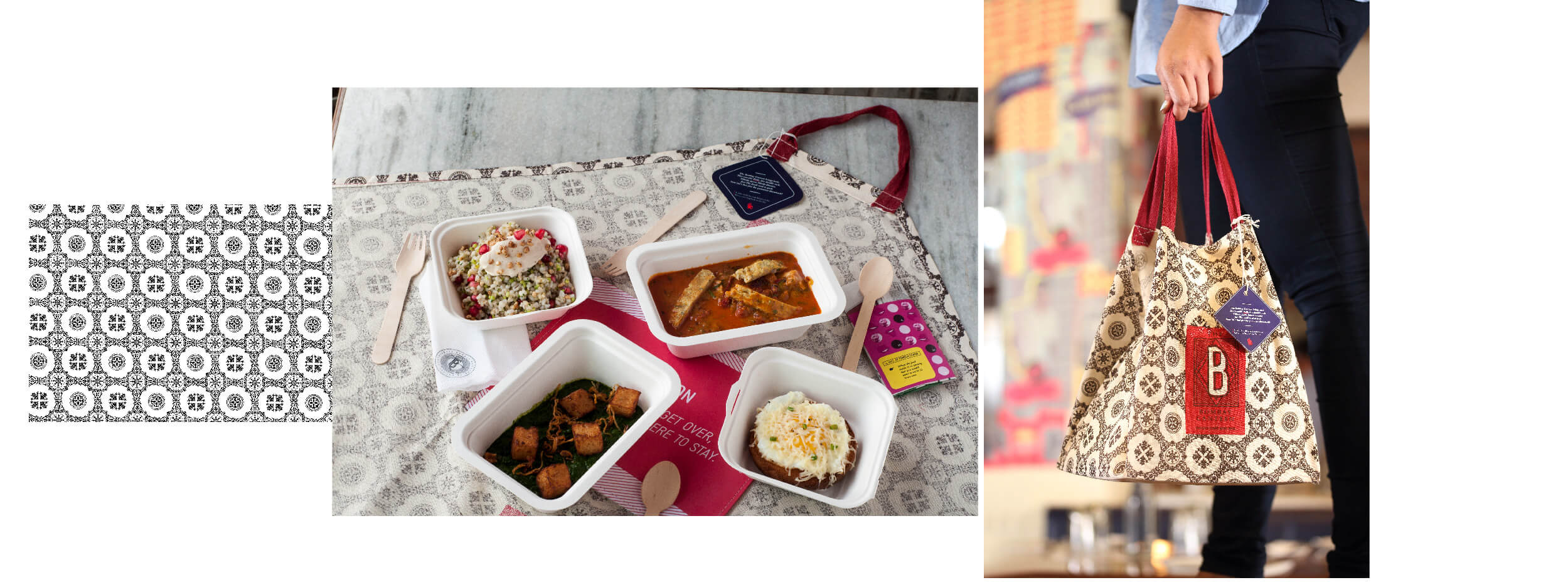
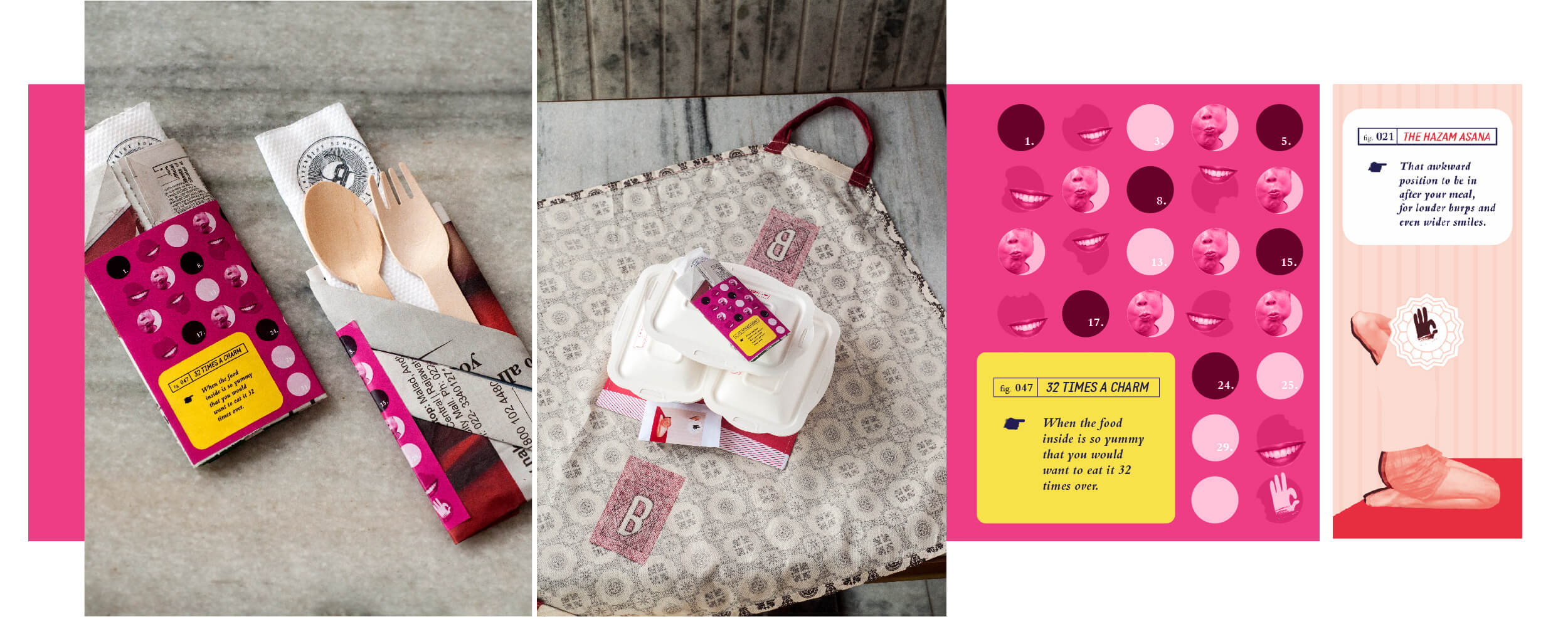
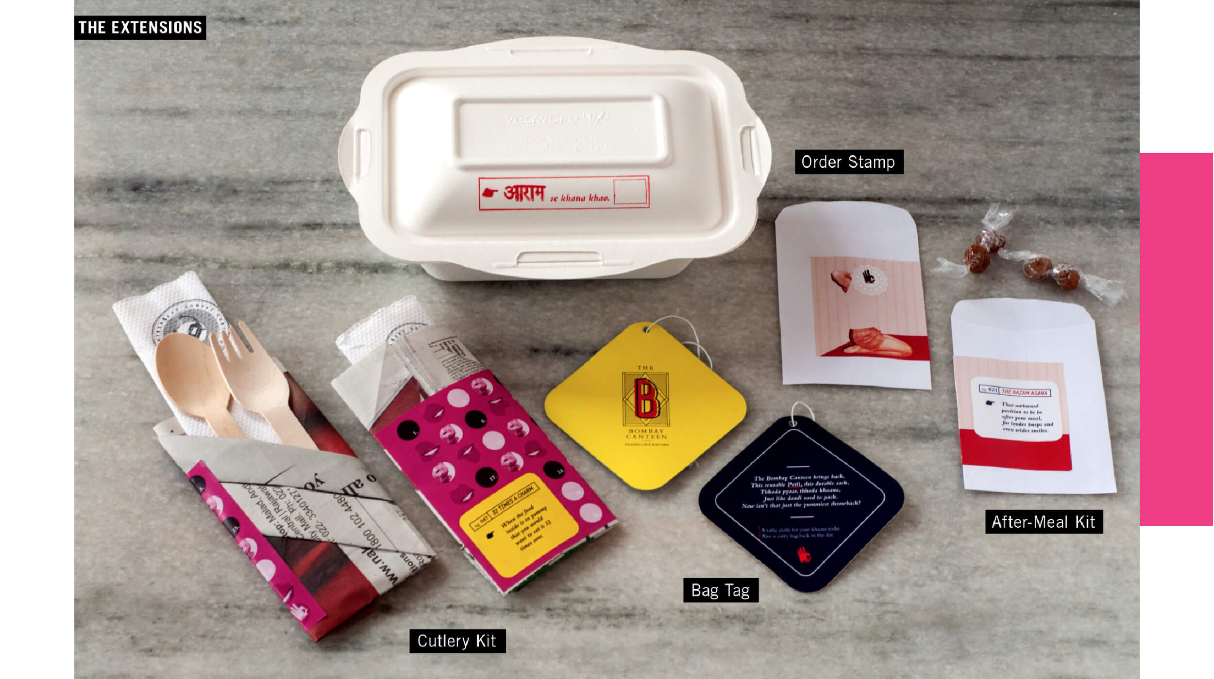
An important aspect of the brand is to be rooted in India. Traditionally, most food packaging in India has been reusable and sustainable. To aid sustainability, each delivery bag was created with reusable cotton fabric, the cutlery holders were handmade using newspapers and the boxes were made with biodegradable materials .
This is a story of how we designed a solution for delivery that saved the planet more than 1,00,000 plastic boxes and bags; by going back to our Indian roots. When The Bombay Canteen, an extremely popular restaurant and bar in Mumbai, approached us to design a unique packaging solution — we attempted to try and save the planet.
The Bombay Canteen prides itself on inventing dishes that are recreated from local recipes and customs. The brand experience is rooted in reinterpreting the traditions and culture of the people of Bombay with an added contemporary twist.
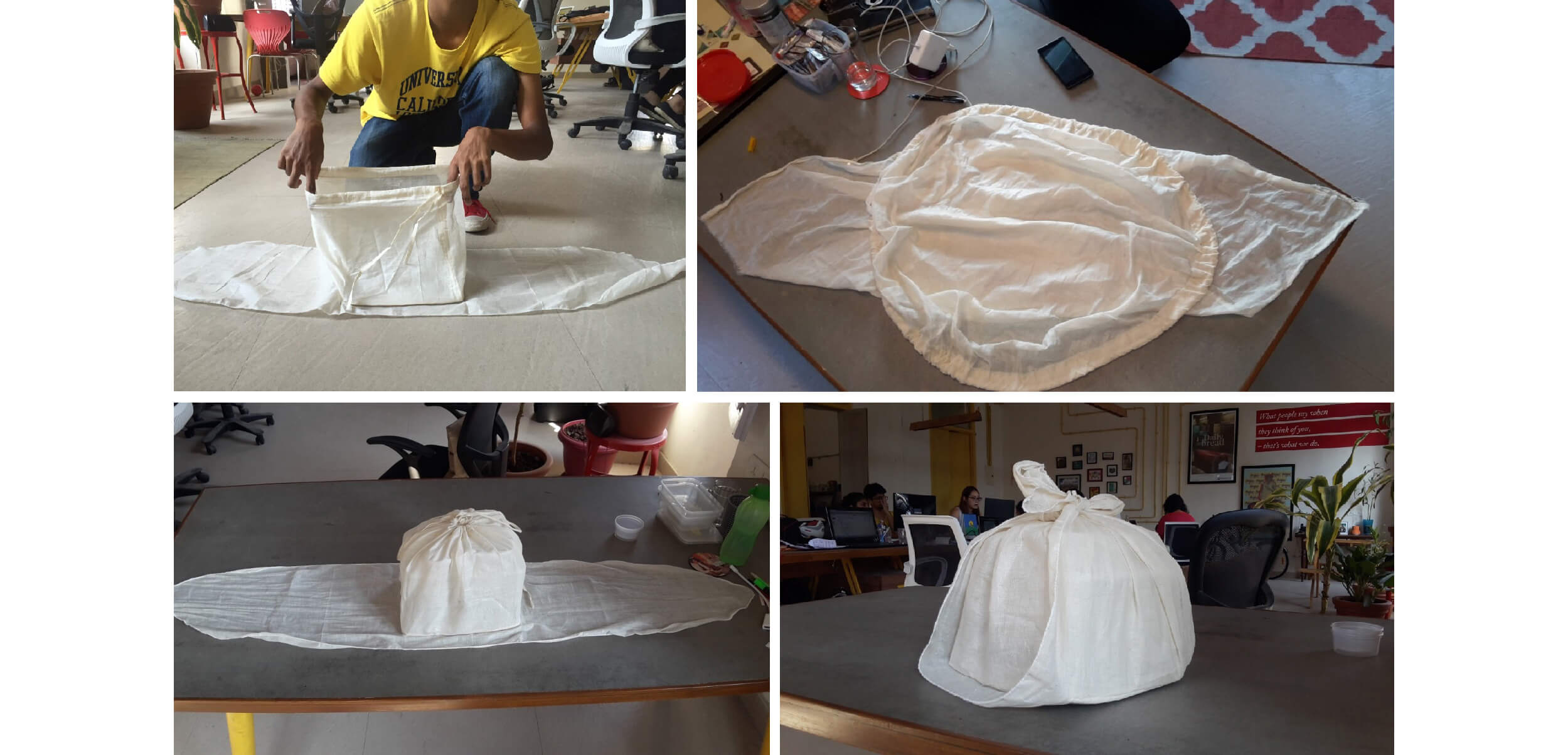
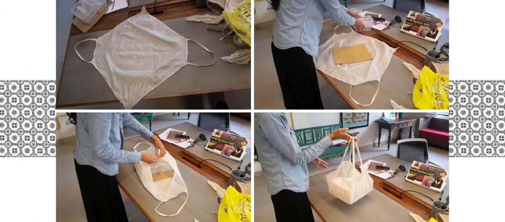
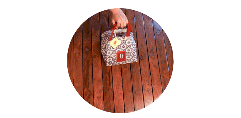
After surveying traditional meal settings, we discovered that historically, most Indians used to carry food wrapped in a piece of cloth. A parcel of sorts, called a potli, that a family would unfold, gather around and eat together during meal times.
Challenge 2: Take the traditional Potli, innovate and engineer the form to recreate a solution fit for today.
We had to allow for multiple boxes, so customers could mix the sauces at the time of consumption. This also meant the boxes could not leak or move around too much — we needed to tie them in securely for our bumpy Mumbai roads.
Solution: After weeks of invention, we designed our version of the potli.
With sturdy handles on opposite sides supporting a cardboard base to make it ergonomically sound, and ties on opposite corners to make sure the food containers remain securely in place.
Challenge 3: We learnt from our research that food delivery was mostly to corporate offices. How could we ‘tie in’ the brand and give them an experience they would remember?
We noted that the habit of relaxing after eating has been fading as people have adapted to a more cosmopolitan routine. Mealtimes are meant to be a time of comfort and relaxation. But, most deliveries were taking place at offices, where no one really takes time out to savour the food they order. How could we change this?
In response, we created ‘The Aaram Life,’ which translates to encouraging patrons to enjoy, share and break for their meal. We intended the potli to open up flat and also function as a tablecloth, and encouraged consumers to use it like a picnic blanket. Finally, there was a provision for a cutlery set, and designed stickers which illustrate how to eat well.
As an agency, Please See// aims to design packaging that can extend beyond its original use and can be appropriated for other purposes.
When designing delivery packaging for The Bombay Canteen, we kept in mind the past, present and future to bring out the key essence of the brand within this touchpoint.
The quintessential Indian packaging — made with no plastic
THE MUMUM CO.// Brand Building
THE PROBLEM:
As most mothers will tell you, getting a kid to eat their meals is one of their greatest struggles. Our job was to find a way to get our brand to entice the kids into eating these healthy snacks while also assuring the mothers that it was good for their children.
Project year
2016
Client
The Mumum Co.
Project type
Food & Restaurants
Location
Mumbai
The Solution:
We wanted to create a brand that spoke to both mothers and children in a language that they could both relate to, and find relevant.
Mumum was started by two mothers who wanted a healthier option for their kids to snack on. When they realised that they weren’t alone in their predicament, they decided to create an all-natural, good-for-kids snack.
Our first port-of-call was mothers — we wanted to know what snacks their kids ate, how they picked snacks for their kids, when they ate these snacks, and everything else in between — basically study usage, attitude and purchase.
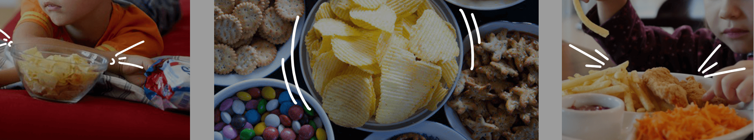
None of these choices were healthy, not to mention, that almost none of the snacks were actually meant for kids! And while feeding the child was a big concern for mothers, they didn’t have too many options. For ideas of the food, she depended on the tried and tested food items that the elders in the family and the mother’s friends knew of.
We found that the international market approach to branding similar products focused on talking to mothers about the health benefits of the products.
While back home in India, we realised that although there were some newer players entering the market for kids’ snacks, the focus on health was missing; and the few healthy products that did focus on health, did so far too seriously to be considered a kids’ snack in the mother’s mind. What we found more interesting, was that while the healthy snacks aisle was beginning to take shape, there was no sign of an aisle or a shelf for kids’ snacks anywhere on the horizon.
The Seed Idea:
Keeping with that sentiment, our design broke away from the expected. Instead of using one font, we decided to use a variety of fonts to create the brand’s logo. The colours and the way the letters come together with different forms and shapes, depict the energy and movement of the brand. The individual letters were designed to represent various members of an Italian family, in all their shapes, sizes and personalities.
All the primary research with mothers and kids and extensive discussions with the founders, helped us finally distill the truth of our brand. We decided to build the brand around the endearing bond that exists between a mother and her child. This became our seed idea and defined everything we did for the brand after.
Our clients had a working name for the brand — Mumum, and after our research we felt the name Mumum fit the idea perfectly. It clearly referred to food (by infants and even toddlers), and hinted at the founders in a way. We tweaked the name to make the brand clearer as an entity and to comply with legal requirements, calling it The Mumum Co.
Defining the Problem:
Discussions we had with mothers made it clear that every mother goes to great lengths, suffers tantrums and performs theatrics to get her child to eat.
And that’s when we wondered — what if our brand could actually make the child want to eat? We were now solving two problems with our brand design:
1. Make the child want to eat → Our brand should talk to kids
2. Assure the mother that this is good for the child → Our brand should talk to mothers
We wanted to be an honest but lighthearted brand that encouraged the child and the parent to have fun.
Brand Design:
Once we convinced our clients that this is what we should do, we moved on to designing the brand.
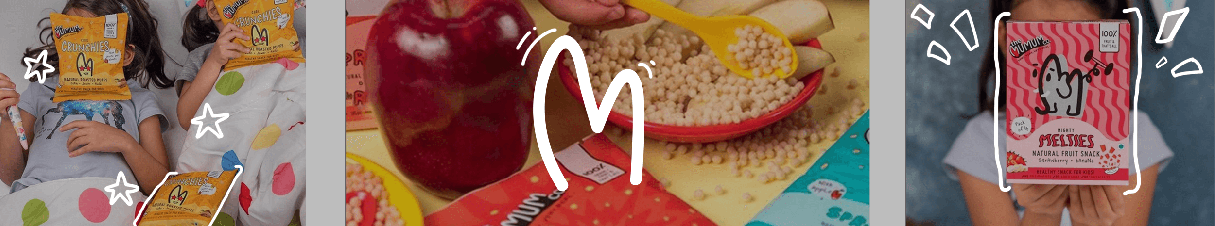
To kickstart the process, we turned to our end-consumer — children! After spending our time watching, observing and playing with them, we knew that if we wanted to make Mumum attractive for kids, we needed to speak their language, in every way we could. Because kids don’t see things the way we do, we had to look at things the way kids would.
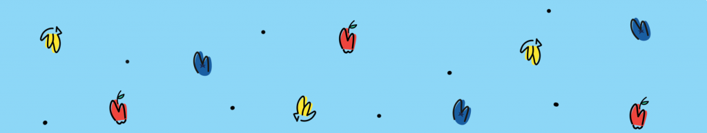
For our visual language, we explored all the ways in which mothers interact with their kids before we found ourselves gravitating toward doodle drawings. We used a doodle style M from Mumum to create unique representations for our product ingredients and brand attributes. This was a powerful route, as it meant that even if we wanted to represent something like carrots, we could do it in a style we could own so that kids could relate to it and mothers could see exactly what her baby was eating.
For the main brand identity we took the M of the logo and turned it into a heart to emphasise the love between mums and their kids. The M and the heart, also became the most responsive part of our logo, turning into characters, animals and ingredients to engage with the imagination of kids.
Our verbal language was based on the way kids speak. Literary devices like repetition, alliteration and language that is colloquial for children in general, came to define our verbal style.
It’s rooted in exaggeration, creating a world that’s bigger than a child knows. Hence, the tagline couldn’t be ‘Very Real’; it had to be ‘Very Very Very Real’!
The simple language also made it easier to break down all the ingredients and processes in a lucid and easy-to-understand manner for the mother to read while still retaining the brand’s lighthearted and fun elements.
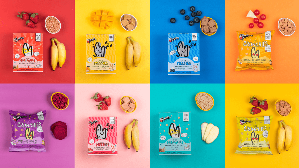
Packaging Design:
From our past experience and our primary research, we found that the best way to understand a product is through its texture, shape and taste.
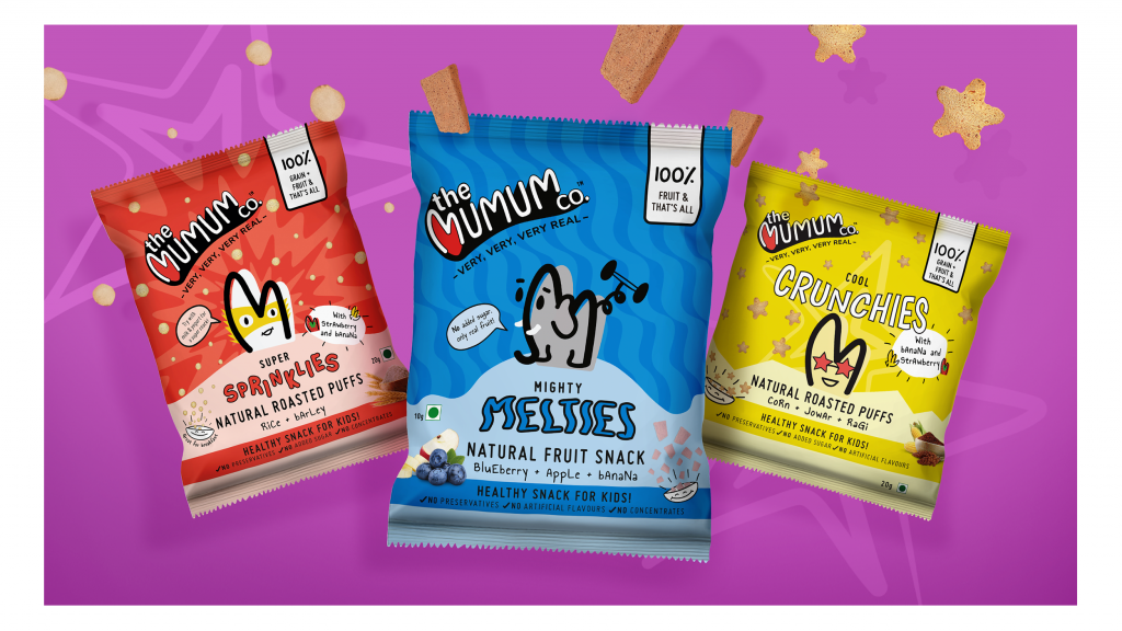
And that’s how we came to name the Mumum product lines — Melties, Crunchies, Chewies and Sprinklies. Since our brand language centred around children, we needed to ensure that each texture variable name was distinct enough from the other.
To this end, we created characters that personified each product line on the front of the pack. Eg. Melties got an Elephant to own the mightiness! The typography of the product name, and the patterns were also inspired from the texture of the product.
On Shelf:
Since there was no real category for children’s snacks in most shops, we needed the product to stand out that much more when stacked on shelf along with other health food products.
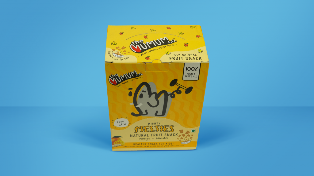
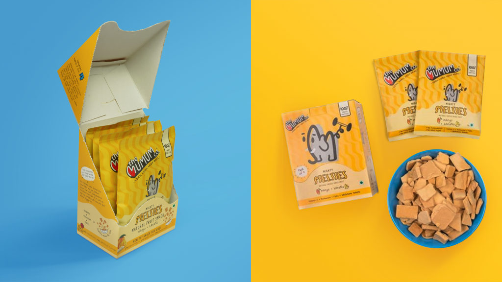
When our client expressed their idea of creating a multi-pack that could also double up as a ready shelf unit, we designed what we like to call the ‘retail-ready tray’. The design of the tray served a dual purpose — a retailer could sell this as a multi-pack of 4 bags, but they could just as easily tear off the top and use it as a tray for individual bags. The multi-pack later became the main SKU for our online channels. The pack of 4 made it more practical for consumers to buy online, and also easier for online players to manage efficient delivery.
Happily Ever After?
A strong brand language enabled the brand to stand out across touchpoints — pop-ups, on-shelf, website, etc.
We don’t necessarily believe in fairytales, hence we are always learning, and striving to do a better job. Which is why we’re still making minor revisions to our designs, and are in the process of extending the range to include more products that will appeal to more consumers.
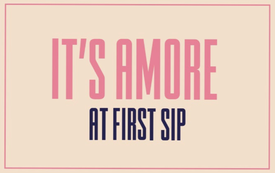
CINCIN// Brand Building
THE PROBLEM:
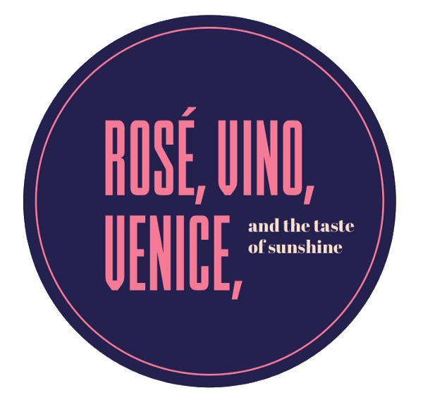
CinCin, prounounced Chin Chin, is an Italian restaurant and bar that wanted to give Indians a taste of an authentic Italian experience.
OUR DIRECTION:
Unlike most brands that would use a foreign language to stay a cut above the rest, we decided to incorporate Italian in a more inclusive way, by giving pronunciation cues and even explaining how these phrases are relevant to everyday life in Italy.
Project year
2017
Client
Cin Cin
Project type
Food & Restaurants
Location
Mumbai
Our clients are well-established restaurateurs who cater to the discerning Indian customer with their brands such as Yauatcha, Hakkasan and Nara Thai, all of which are brands they have brought to India. When they wanted to build their own from the ground up, they approached us knowing our strength, which is to look at brands through a fresh and unconventional perspective.
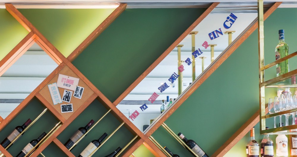
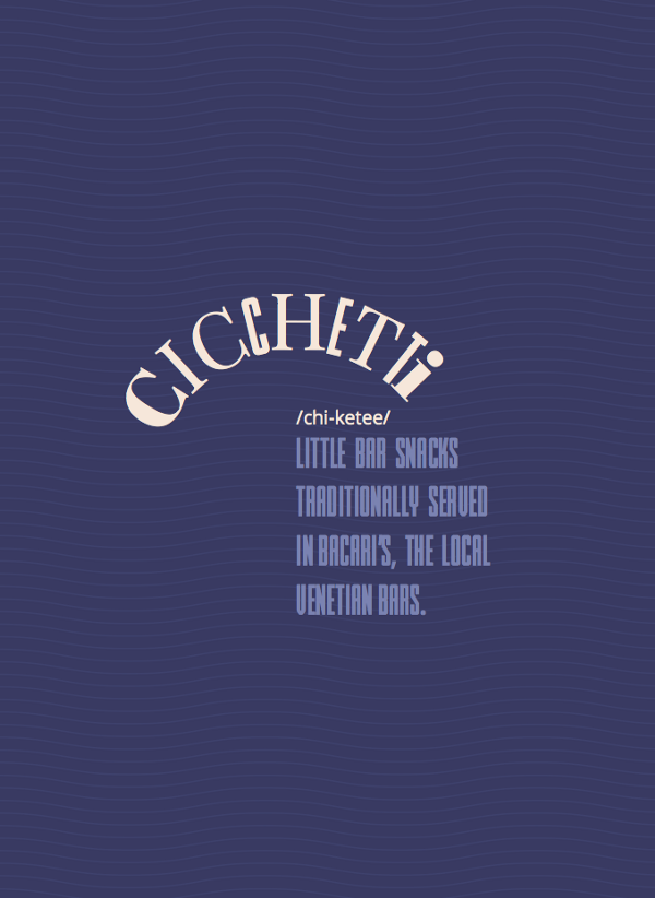
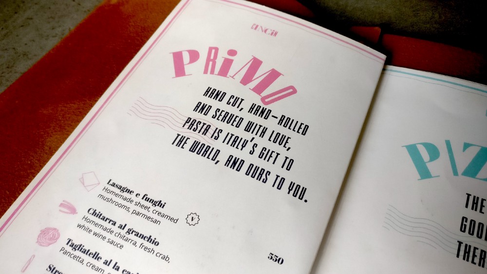
When building out a restaurant concept, there are multiple directions we could have taken. We could focus on new types of Italian food — in this case cicchetti (Italian small plates). Or build out a traditional Italian pizzeria concept, where the consumer is transported to a time and place.
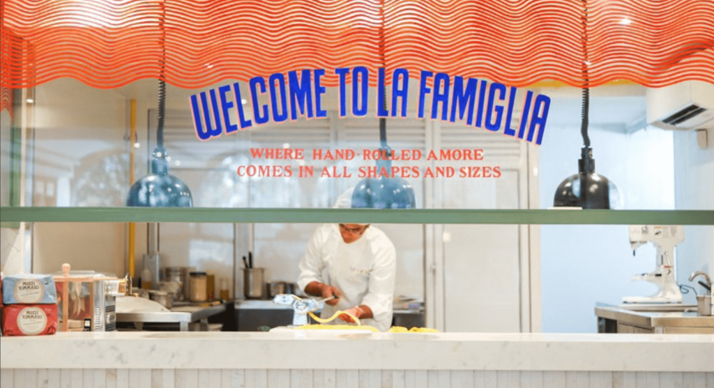
After numerous hours of research, deliberation and ideation, we drove the team to design out a feeling. The concept we set out to design, was a restaurant that provided a vibe that was energetic, exciting, passionate and fun. We aimed to serve the neighbouring corporate community with a modern and fun Italian experience, that resonated with the upwardly mobile.
This picture, says everything we wanted the brand to be
INSTEAD OF GOING THE TRADITIONAL WAY OF PORTRAYING ITALY, AS A GODFATHER MOVIE, WE WANTED TO SHOW IT FOR WHAT IT IS TODAY. FUN, EXCITING, COLOURFUL AND AUTHENTIC.
Keeping with that sentiment, our design broke away from the expected. Instead of using one font, we decided to use a variety of fonts to create the brand’s logo. The colours and the way the letters come together with different forms and shapes, depict the energy and movement of the brand. The individual letters were designed to represent various members of an Italian family, in all their shapes, sizes and personalities.
We wanted the logo (and everything else after) to replicate this essence of unconventional
Not only does the visual language stay true to the essence of Italy, but the verbal language too, incorporates Italian phrases in a fun and comical way.
Besides family, fun and vivacious energy, we didn’t want to leave out the sunshine, the sea and the assortment of food and wine that everyone thinks of when they dream of Italy. Although it wasn’t our main focus, you’ll find hints of all these things in our various designs.
Design patterns on the pasta counter are inspired by the waves of the Amalfi coast and colours from the beach umbrellas
WE WELCOME CINCIN INTO PLEASE SEE’S FAMIGLIA OF RESTAURANTS!
Changing the way kids snack, with design that speaks their language
Problem to solve:
As most mothers will tell you, getting a kid to eat their meals is one of their greatest struggles. Our job was to find a way to get our brand to entice the kids into eating these healthy snacks while also assuring the mothers that it was good for their children.
Solution:
Creating a brand that speaks to both mothers and children in a language that they can both relate to, and find relevant.
How it started:
Mumum was started by two mothers who wanted a healthier option for their kids to snack on. When they realised that they weren’t alone in their predicament, they decided to create an all-natural, good-for-kids snack.
When they approached us with their vision of creating an honest brand that could enable better eating habits and snacking for children, we jumped at the chance to create a brand that would set the tone for this almost non-existent category of food in the Indian market.
Research & Analysis:
Our first port-of-call was mothers — we wanted to know what snacks their
kids ate, how they picked snacks for their kids, when they ate these
snacks, and everything else in between — basically study usage, attitude
and purchase.
Young kids have sensitive taste buds; so typical packaged snacks, especially sweet ones offer an explosion of taste that they love. These snacks are also easily accessible and much advertised increasing desirability.
When we asked them what their kids ate between meals, these were the answers we got:
Kurmura, Lays, Mad Angles, Dahi, Chocolate.
None of these choices were healthy, not to mention, that almost none of the snacks were actually meant for kids! And while feeding the child was a big concern for mothers, but the mother didn’t have too many options for what she could feed her child. For ideas of the food, she depended on the tried and tested food items that the elders in the family and the mother’s friends knew of.
From our Shelf and Market Landscape research, we found that the international market approach to branding similar products focused on talking to mothers about the health benefits of the products. While back home in India, we realised that although there were some newer players entering the market for kids’ snacks, the focus on health was missing; and the few healthy products that did focus on health, did so far too seriously to be considered a kids’ snack in the mother’s mind. What we found more interesting, was that while the healthy snacks aisle was beginning to take shape, there was no sign of an aisle or a shelf for kids’ snacks anywhere on the horizon.
The Seed Idea
All the
primary research with mothers and kids and extensive discussions with
the founders, helped us finally distill the truth of our brand. We
decided to build the brand around the endearing bond that exists between
a mother and her child. This became our seed idea and defined
everything we did for the brand after.
Our clients had a working name for the brand — Mumum, and after our research we felt the name Mumum fit the idea perfectly. It clearly referred to food (by infants and even toddlers), and hinted at the founders in a way. We tweaked the name to make the brand clearer as an entity and to comply with legal requirements, calling it The Mumum Co.
Defining the Problem
Discussions
we had with mothers made it clear that every mother goes to great
lengths, suffers tantrums and performs theatrics to get her child to
eat. And that’s when we wondered — what if our brand could actually make
the child want to eat?
We were now solving two problems with our brand design:
1. Make the child want to eat → Our brand should talk to kids
2. Assure the mother that this is good for the child → Our brand should talk to mothers
We wanted to be an honest but lighthearted brand that encouraged the child and the parent to have fun.
Brand Design:
Once we
convinced our clients that this is what we should do, we moved on to
designing the brand. To kickstart the process, we turned to our
end-consumer — children! After spending our time watching, observing and
playing with them, we knew that if we wanted to make Mumum attractive
for kids, we needed to speak their language, in every way we could.
Because kids don’t see things the way we do, we had to look at things the way kids would.
For our visual language, we explored all the ways in which mothers interact with their kids before we found ourselves gravitating toward doodle drawings. We used a doodle style M of Mumum to create unique representations for our product ingredients and brand attributes. This was a powerful route, as it meant that even if we wanted to represent something like carrots, we could do it in a style we could own so that kids could relate to it and mothers could see exactly what her baby was eating.
After exploring various design routes, we settled on this one which plays up the ‘M’ in different ways—the identity needed to be warm but also exciting. Working logos (left), Final logo for the brand (extreme right)
For the main brand identity we took the M of the logo and turned it into
a heart to emphasise the love between mums and their kids. The M and
the heart, also became the most responsive part of our logo, turning
into characters, animals and ingredients to engage with the imagination
of kids.
Bringing the ingredients to life in our language
Our
verbal language was based on the way kids speak. Literary devices like
repetition, alliteration and language that is colloquial for children in
general, came to define our verbal style. It’s rooted in exaggeration,
creating a world that’s bigger than a child knows. Hence, the tagline
couldn’t be ‘Very Real’; it had to be ‘Very Very Very Real’!
The simple language also made it easier to break down all the ingredients and processes in a lucid and easy-to-understand manner for the mother to read while still retaining the brand’s lighthearted and fun elements.
Packaging Design
From our past experience and our primary research, we found that the
best way to understand a product is through its texture, shape and
taste. And that’s how we came to name the Mumum product lines — Melties, Crunchies, Chewies and Sprinklies. Since
our brand language centred around children, we needed to ensure that
each texture variable name was distinct enough from the other.
A wide product range meant that the colours, patterns and characters all needed to come from one family, while ensuring each pack could stand out by itself.
To this end, we created characters that personified each product line on
the front of the pack. Eg. Melties became and got an Elephant to own
the mightiness! The typography of the product name, and the patterns
were also inspired from the texture of the product.
On Shelf
Since
there was no real category for children’s snacks in most shops, we
needed the product to stand out that much more when stacked on shelf
along with other health food products. When our client expressed their
idea of creating a multi-pack that could also double up as a ready shelf
unit, we designed what we like to call the ‘retail-ready tray’.
With an easy-to-tear-off top, the multipack doubles up as box to keep individual packs in — on the shelf or even on the counter.
The
design of the tray served a dual purpose — a retailer could sell this as
a Multi-pack of 4 bags, but they could just as easily tear off the top
and use it as a tray for individual bags,
The multi-pack later became the main SKU for our online channels. The Pack of 4 made it more practical for consumers to buy online, and also easier for online players to manage efficient delivery.
Happily Ever After?
A strong brand language enabled the brand to stand out across touchpoints — pop-ups, on-shelf, website, etc.
A strong brand language enabled the brand to stand out across touchpoints — pop-ups, on-shelf, website, etc.
We
don’t necessarily believe in fairytales, hence we are always learning,
and striving to do a better job. Which is why we’re still making minor
revisions to our designs, and are in the process of extending the range
to include more products that will appeal to more consumers.
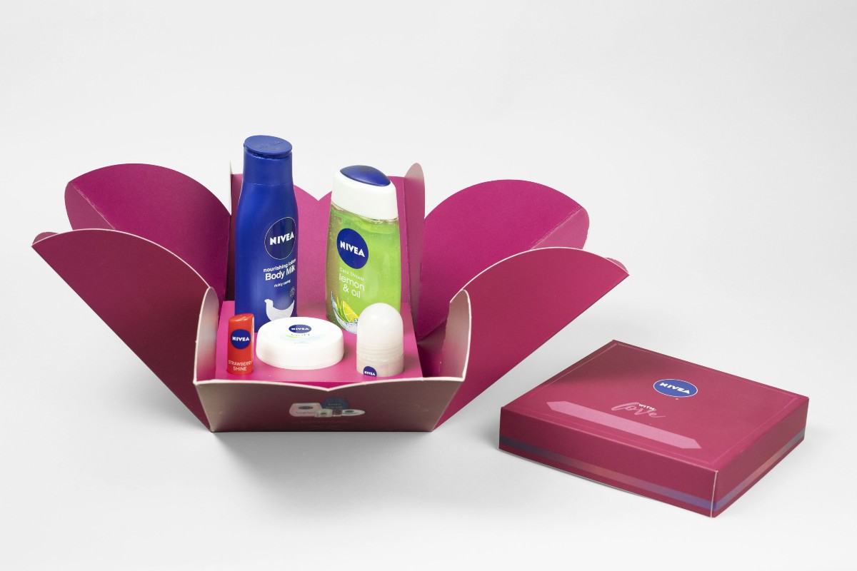
NIVEA GIFTING// Packaging Design
PROBLEM TO SOLVE:
To change the perception of Nivea from an everyday essentials brand to a brand that people would consider a fun gifting option.
Project Year
2018
Client
Nivea
Project Type
Fashion & Beauty
Location
Mumbai
The Solution:
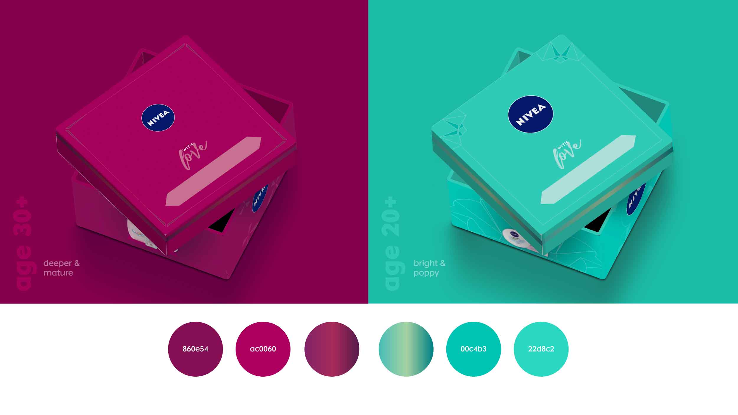
To create a gift box that pushed Nivea to go beyond the traditional blue in order to create something that stood out and was relevant for their target audience.
The first thing that comes to most peoples’ mind when they think of Nivea is “daily essentials”, not gifting. That’s where we came in. Our job was to design a Nivea gift box for women that people would want to give to their loved ones over the festive season.
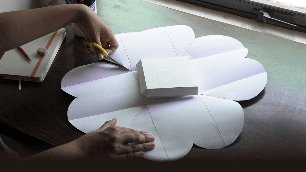
The insight that most excited us about a gift box was the feeling of joy you get when you unwrap a gift and that’s the feeling we knew we needed to translate into this gift box. In order to create this feeling, we decided to not only design the outside of the box, but to actually engineer the box from scratch to get the impact we wanted.
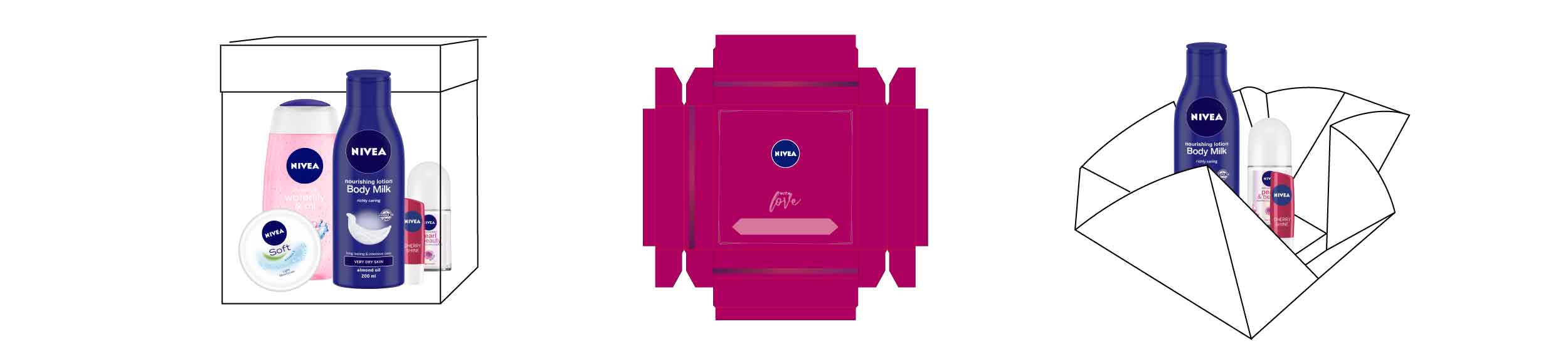
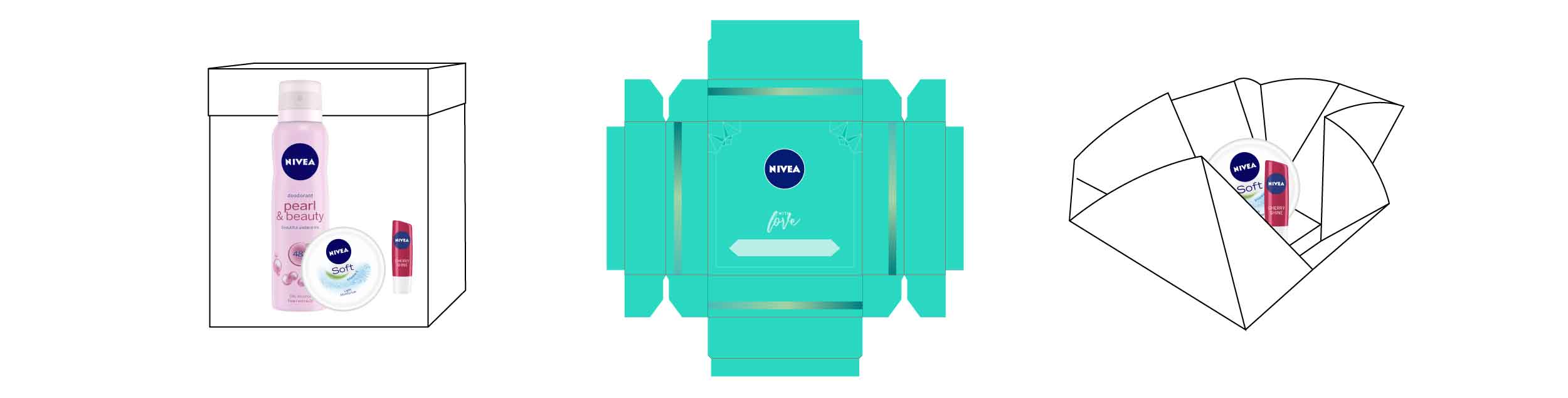
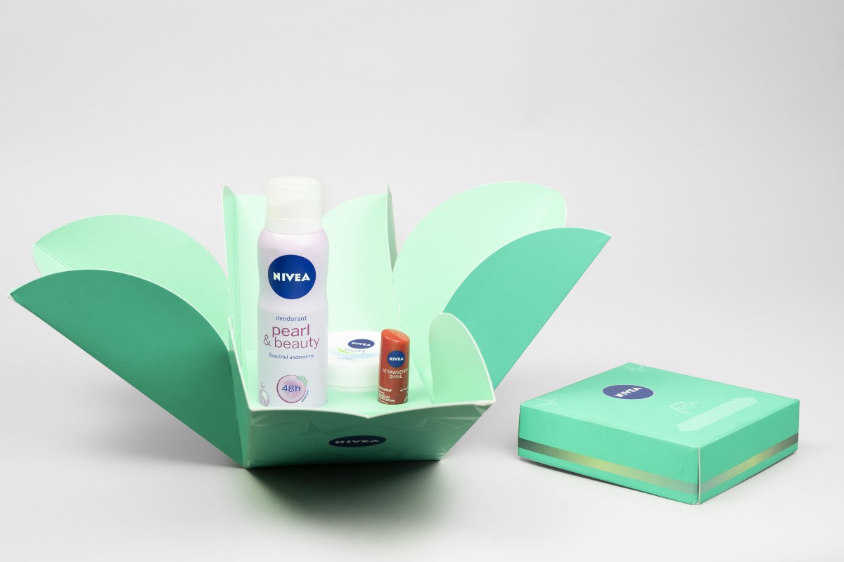
Engineering a box from scratch came with its own set of challenges; it had to be beautiful, but it also had to be practical, strong and sturdy enough to survive transport and stacking on shop shelves. We explored multiple directions before finally settling on the design for a box that would open like a flower to reveal the Nivea products inside. The flower was a perfect representation of the beauty we were looking to create and the soft touch of care that lies at the core of Nivea, the brand. The cherry on top, was adding a sign-off that said “With love” leaving a blank space for the person gifting the box to handwrite their own names. Thereby adding their own personal touch to the gift box.
A lot of thought and research went into choosing the right colours for the gift boxes. We made a conscious effort to not use Nivea’s traditional blue and chose instead to use a deeper, more mature red for women in their 30s or older; and a bright pop of teal for the younger women.The geometric pattern on the outside of the box represents a burst of light, the centre of all festivities filled with brightness and joy in India.
At the end of all our research and design, we successfully managed to break away from Nivea’s traditional outlook to create a box that was brighter, more emotional and definitely more gift-worthy.
We proposed two colours for the gift boxes for women. We assigned a deeper, mature red to the box for women aged 30 and above and a bright, popping teal for younger women. In addition to being aesthetic, the box had to be strong and sturdy to survive transport and stacking on shelves.
Cin Cin segon
The problem
Cin Cin, prounounced Chin Chin, is an Italian restaurant and bar that wanted to give Indians a taste of an authentic Italian experience.
Our direction
Unlike most brands that would use a foreign language to stay a cut above the rest, we decided to incorporate Italian in a more inclusive way, by giving pronunciation cues and even explaining how these phrases are relevant to everyday life in Italy.